Regression analysis
Regression analysis is the process of predicting the numerical values of your target variable based on the available data.
These types of problems don't have an answer in terms yes-or-no. Imagine that you're going to sell your house and you don't know what price to set so that this would be a good deal for you according to a market situation. You have some data collected from a website on houses prices. Based on this data you want to know (predict) the best possible price on your own property. In other words, you are going to solve a regression problem.

If we have a collection of observations on houses prices (like the one in
Sample data set section),
we may try to explore what drives the prices and predict the price for
selling our own property.
The result of each observation here is represented with a value of
SalePrice for a certain house.
In this data, an observation is a house with certain attributes (leaving area, overall quality and conditions, type of heating, garage conditions and many others):

We can see that SalePrice column contains continuously changing
numerical values of a price. As already mentioned above, our goal is to
predict a price for a new houses learning from the available data.
That means, we are going to explore the regression problem.
The goal of the analysis on houses prices prediction is to find the answers for following questions:
- What drives prices of the houses?
- What is a price of a certain house?
- Which factors should a potential buyer (or seller) pay attention to find (or sell) the best possible property within his financial possibilities?
In this case study, we use the data set on house prices with the following configuration:
- We choose all the columns as inputs;
- We select
SalePricecolumn as theKPI; - We set 3 number of runs;
- The outliers elimination option stays
ON.
If the process of creating a story is not clear for you yet, please refer to our Create Story guide to get used to the story creation process.
Once your story is ready, you can see a brief summary of story parameters on
Your Stories page: the dimension of columns and rows used, date of story
creation (or date of sharing in case the story was shared with you),
name of the author. Also general story results are displayed here, they are:
model accuracy, KPI name, as well as a driver overview summary.

Click the story name and dive into the slides.
1. Summary
On the first slide you see the contents of the whole story analysis. The story consists of 12 slides.

Every slide features a thumbnail you can use to browse easily through the story:

2. Data Overview
On the Data Overview slide you can find the high-level summary of the uploaded data set. Here you can observe:
- Row count - the number of records in the uploaded data
- Column count - the number of columns in the uploaded data (together with the KPI column)
- Total count of cells - the number of cells found in the uploaded data
- Percentage of missing cells represents the fraction of missing cells in the total cells number. The less this value is, the better.
- Number of
far outliersfound - this cell will show you the total number of the values in your data set that were far or not typical for the observed values (if the option Eliminate far outliers was ON before starting a story).
The summary table also represents how many variables (columns) of each class we found in the uploaded data.
From the given overview you can conclude that the data set contains mostly categorical and numerical variables (in equal proportions). You can also notice that the data contains comparatively small amount of missing values (only 6%) which in general describes the data as reasonable:

3. Global Data Health
On the Data Health slide you can observe the statistics for the columns of your data. Here we define the metrics about your data that can provide you with the information about "how healthy" your data is.
Here we present:
- Available data per column - the average fraction of non-missing data per column. The more this value is, the better.
- Outliers per column - the average fraction of statistical outliers found per column. The less this value is, the better.
- Distribution quality per column - how well in average the data is distributed all over the domain. The more the value is, the better.
Read more about data distribution and statistical outliers.
You can also notice a proportion of missing data (the greater a green area of circle is, the better) and a statistics on how your data distributed (the greater a green area of circle is, the better model will be built).
Data health situation on Houses prices data reflects that poor data distribution quality of the columns (25,7%) has significant impact on the general health by decreasing it (72,9%).

Click on the red part of the donuts to filter the table below on the problematic columns and explore them closely.
Tip: Click on the header of the table to sort the columns to look at the columns with the worst distribution.
You can notice, for example, that the column
Pool Areahas 0% distribution quality, but this is mostly due to the fact that most of the houses don't have pools and this variable is filled with 0 in these records (you can see that median for this variable is 0). All the other records havePool Areavariable filled with all different values, because unlikely you'll find two houses with exactly the same pools:

In such a manner you can explore the problematic columns one by one. But then the question raises: why is poor quality bad and what can you do to improve the columns distribution?
If a column is poorly distributed, but actually it performs as a significant variable to predict the KPI, then the information containing in this column won't be enough to choose this column as important. What should you do then?
Read the glossary note on the distribution quality.
Sometimes, if you can control the data yourself (for example, you manage the manufacturing line where you collect the data from), you can improve the data quality by requesting more data for the poorly distributed variables (or for example, organise more experiments).
Otherwise, if you have no influence on data collection process (as in our example with Houses prices data), the model will have to deal with the variables that are available (in spite of the poor quality). But here is the good news! DataStories algorithm is developed and trained to extract and deliver the best possible model even on such a data. Of course, it doesn't mean that you can use only 'red' variables in the analysis as it can still deliver a bad impact on the results. So check if you can improve the health of your data by extracting the info from DataStories diagnostics.
4. KPI slide
This slide contains the information about your target column
SalePrice.
Here you can observe the KPI values plotted as they appear in the
data. You can use sorting by record number to explore how the areas of
missing data are concentrated in the KPI
or you can see if the data appears in a periodical behaviour: it might be
a signal for you that your data is formed from the same repeated amount of
records.
From the plot below you can conclude that there are no areas of missing concentration and no periodical behaviour in the
SalePricecolumn:Below is an example of the plot with a direct signal for you to check why some areas of the KPI contain missing values in a row. Probably, your sensors were broken for a while?
The example below shows the periodical behaviour of the KPI rows. Check, why the records repeat themselves, is this your intention?


Sorting the plot by KPI value allows you to see the range of
the KPI: whether it is significant or not.
For the Houses prices data we can see a few records with too expensive or too cheap prices, but in average we can conclude that the price is distributed evenly:

But what can you do if you see your KPI values have several
strongly dominating areas? In this case, for example, if you deal with
manufacturing you may check
whether your manufacturing lines support different regimes.
In such a case it might be useful to split the data into different parts corresponding to each regime of a line. Separation of the data will help a model to predict better for each regime, otherwise this factor will be an extra parameter for model to decide on.
As an example, the plot of the KPI below clearly demonstrates two different regimes:

5. Simple Correlations
On this slide will find the relationship between the variables.
Before going to search for connection of your variables to the KPI, we check how the columns in your data are connected to each other. It's important to notice some relationship between the variables, because you can either find some new unexpected relationships in the variables or to prove the known ones.
Based on this information, for example, you can decide to go into another iteration of analysis with using only independent variables, because all others are strongly connected to each other.
DataStories algorithm groups the variables that represent the same information with the respect to the KPI and chooses only the one with the stongest relation to use further in the analysis.
For example, you can see that
Garage conditionis strongly shares a lot of information withGarage Quality. DataStories will use only the strongest one of them for its learning algorithm:

Use the slider to adjust the strength of shown relationships. The plot will show the connections with the chosen strength and higher. 100% strength will display only the strongest connections (if there are any).
By highlighting the KPI you can explore the strongest KPI
connection to the other variables.
So even without predictive (modelling) part you can already see the order
of relationships with your target.
So we can conclude that the
SalePriceconnected to theOverall quality,External quality,Kitchen qualityandGround living area:

DataStories platform explores two types of relationships between the variables: linear correlation and mutual information. By choosing the linear correlation or mutual information tab, you will see the corresponding relationships.
Tips:
- Use Additional settings to adjust the radius of a circle, set the text size and capacity or hide unconnected variables,
- Use Search field to find and highlight the necessary variable.

6. Pair-Wise Plots
Once we had a look at the variables' relationships and found the connections, we can go further to observe in details their pairwise behaviour with using a scatter plot.
On pair-wise plots you can explore all the variables versus the KPI, ordered by the mutual information with the KPI.
Click on the name of the variable to build the corresponding scatter plot.
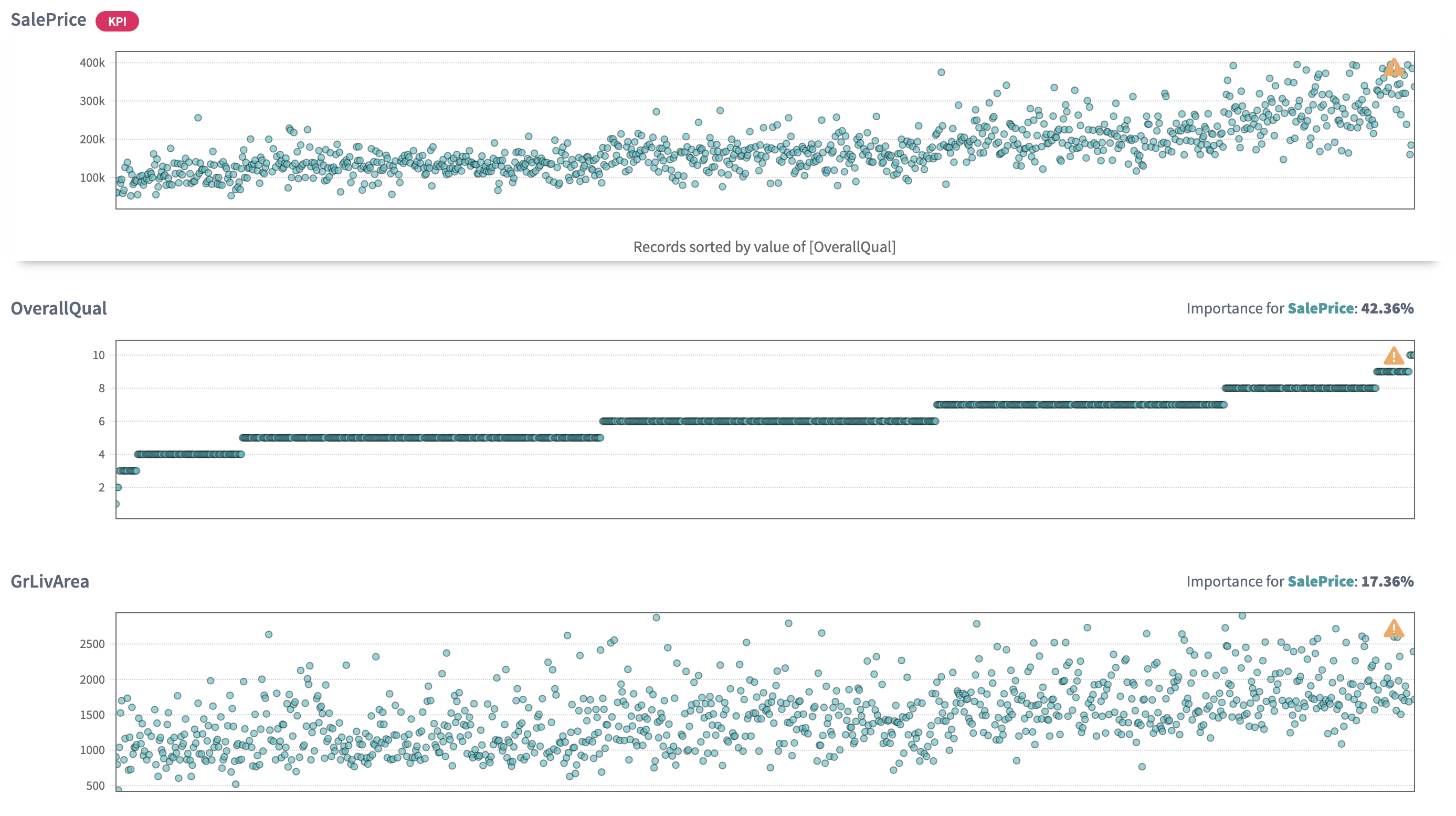
The scatter plot of
Overall qualityshows that with the increase of quality theSalePriceis also getting higher. So being a seller I can conclude that before setting a price on a house I should set the quality of my house (probably by asking some market experts to evaluate it):The same we can say by looking at
Year builtscatter plot: the 'younger' the house is, the higher its price. So I should take this info into account when setting the price on my property:By looking at the
Garage carswe can see that the houses with garage capacity for 2 and 3 cars are in a higher price (because they are in a high demand), and capacity for 4 cars demonstrates lower price probably being in a low demand (as a rare family owns 4 cars).

By analysing the scatter plot, you have a chance to find predictive behaviour for some variables and mark some areas of interest within your observations. It also might be, that the plot won't show any regular relations in the variables.
7. Linear vs. Non-linear relations
The Linear versus Non-linear slide represents a bar-chart, where you can observe linear correlation and mutual information next to each other.
Comparing these two values for each variable might give additional insights into the complexity of your problem.
The dependency for mutual information is more complex than for linear correlation, that’s why variables are not always linearly correlated if there is mutual relationship between two variables.
Some variables can show no linear correlation to the KPI, but they still can be related to it with mutual information, so you can not eliminate these variables.
DataStories analyzes all the variables to detect whether they are connected to the KPI:
The chart below shows that these variables demonstrate less linear correlation to the KPI SalePrice than mutual information to it:

Tip: use search field to leave only the most interesting variables on the bar chart.
8. Driver Overview
So far, the story covered the descriptive analytics.
The Driver Overview slide starts the section of predictive analytics,
delivered by the DataStories platform. Here you can see, which variables
the model has picked up as important to predict SalePrice.
How does DataStories make a decision on which variables to choose?
We don't try to deliver you the most complex model with 100% accuracy. Why? Because such a model won't be actionable. The goal of the analysis is to derive a model you can control and act on. That's why our algorithm is developed and trained to choose the optimal combination of complexity and quality: so that with the further increasing of model complexity, the increase of the quality would be insignificant.
On the slide you can see the driving features, drivers, ordered by their importance.
The chart demonstrates that the model chooses 8 drivers to predict
SalePricewith 90,1% accuracy.The
Overall Qualityis picked up as the most important factor (42%) that has impact on the final house price, which looks logical:

We also can notice that the model selected 8 important variables out of 79, which demonstrates the simplicity of the model. Usually, the more parameters the model includes as important, the higher possibility of this model to overfit.
Look at accuracy to check the model: of course, to do the valid the conclusion its values may differ from problem to problem, but on average you can claim that if the accuracy is not high (lower than 65%), then probably your data is not enough to built a reliable predictive model. That indicates, you should try to find additional sources of data: take more experiments and collect more observations. Probably, you might decide to look for additional features, useful to observe and include into the analysis.
As we can see, the model didn't choose a group of highly correlated variables we saw before, but chose one of them,
Garage cars.So all in all, from the picked up variables, the
TotalBsmtSFthat representsTotal square feet of basement areais the most unexpected one. Have you ever cared about basement when buying a house? Me not :)
9. What-Ifs
On the What-Ifs slide you can explore the behaviour of the KPI while
changing the drivers value underneath the plots.
Each plot demonstrates the dependency of the
SalePricefrom each driver:

With a change of a driver value, the KPI will change
according to the model behaviour.
The first usage of What-ifs plots is a monitoring the influence of a certain driver on the KPI. To interpret the plots correctly, when changing one driver value you should keep the same values of all other drivers.
For example, by making
Ground living arealower, we can see that the price is intended to decrease (with given configuration of other drivers):Observe that the curves of the other plot change while modifying the value of a give driver, because the cut-view of those graphs are dependent on all the variables a priori.
The What-ifs plots can also be used when you have a new observation without a prediction and you want to predict it. Then what you need to do is to put values for drivers into the fields and get the predicted value of the KPI.
Imagine you own a house with the following configuration of driving characteristics, then what will be the competitive price for it? Fill in the input fields and check out the
SalePricevalue!
A reverse problem would be: which characteristics will a house satisfy to if I have a fixed budget to buy it?
For example, what will be the driving characteristics of a house if I want to minimize the cost? Click the
Minimizebutton and the plots will show the values of the driving variables that will minimiseSalePrice.Such houses have lower than average
ConditionandQuality(approx. 3),Living arealower than 1000 m, comparatively lowBasement areaand noGarage cars.

The table below the plots demonstrates the original data enriched with predictions and the prediction range. Click on a row if you want to explore a certain observation.
Tip: the yellow boundary shows the area of uncertainty for the KPI prediction. The wider the area, the higher the model uncertainty for the prediction. Usually, the reason of high uncertainty is lack of data with certain characteristics.
On the example plot below you can see that with the increase of
LiftCoefvariable, the uncertainty is getting lower:

Tip: Download the model in any suitable format to use it further for your needs outside the DataStories platform. See also our documentation about the DataStories SDK.
10. Model Validation
This slide shows you more detailed information about the model predictions.
For a regression problem here you can explore the error plots.
This plot will show you the actual values of the KPI
(SalePrice) and the values predicted by the DataStories model.
The closer these values to each other, the better.
Click the button 'Highlight model-based outliers' to check what are exceptions to the rule found by the model. Normally, such records should present only a small amount comparing to all records.
Sometimes it could give you more information when you sort the plot by KPI value.
Sorting by the value of
SalePricewe can see that the houses with the highest price are the worst predicted. It might be that these houses represent unique (or exclusive) observations and it's better not to look at them when doing general prediction, or it also might mean you have not enough data collected for these records so the model can't extract content from it:Zoom in the area of interest to see closer predicted and actual records:

Below on the slide you can see the plot of actual vs predicted records. The ideal situation is when the plot demonstrates all the points lying on the diagonal. So the best possible cases happen when the cloud of points spreads along the diagonal continuously.
The plot below demonstrates good model performance on
SalePrice. We can observe model-based outliers - the records with predictions not typical enough for the general set of your observations:

You should always check the error metrics on the right and also remember that you can only rely on them together with the visualisation, but not separately from it.
Please, keep in mind that there are situations when the error metrics are close to 1, but the error plot demonstrates you a poor model performance.
This situation might happen, for example, when you have two different regimes for your KPI (your manufacturing line produces on high and low speed) and thus the data stands for 2 different areas or clouds. This is a sign for you to split such a data into 2 sets corresponding to each cloud of the KPI:

Also check the text above the plot on how many predictions were lost because of the missing values or outliers found in the driving variables. Big amount of such records is a direct signal for you to check the data. Improving the data of the driving columns might significantly improve the quality of the model.
After analysing the error plot you can upload the test data to validate the model (to check, how model performs on unseen data).
Upload the validation data directly to the slide:

If your training data was enough and relevant to build the model, then the testing data should give approximately the same results on confusion matrix and show the close metrics. That indicates, that the model has learnt the patterns, but not the exact properties of given data (so the model is not overfitting ).
The error plot for the test data of Houses prices demonstrates good results: the cloud of the dots is located close to the diagonal.
We still observe model-based outliers in the test data which demonstrate the influence of outstanding records in the training data:
11. Driver Plots
The Driver Plots slide allows you to explore how drivers and
the KPI are changing together in the data.
Tip: To find relations between the KPI and the drivers sort
the plots by the KPI value, and to see if there is dependency between
the drivers themselves sort the plots by the drivers one by one.
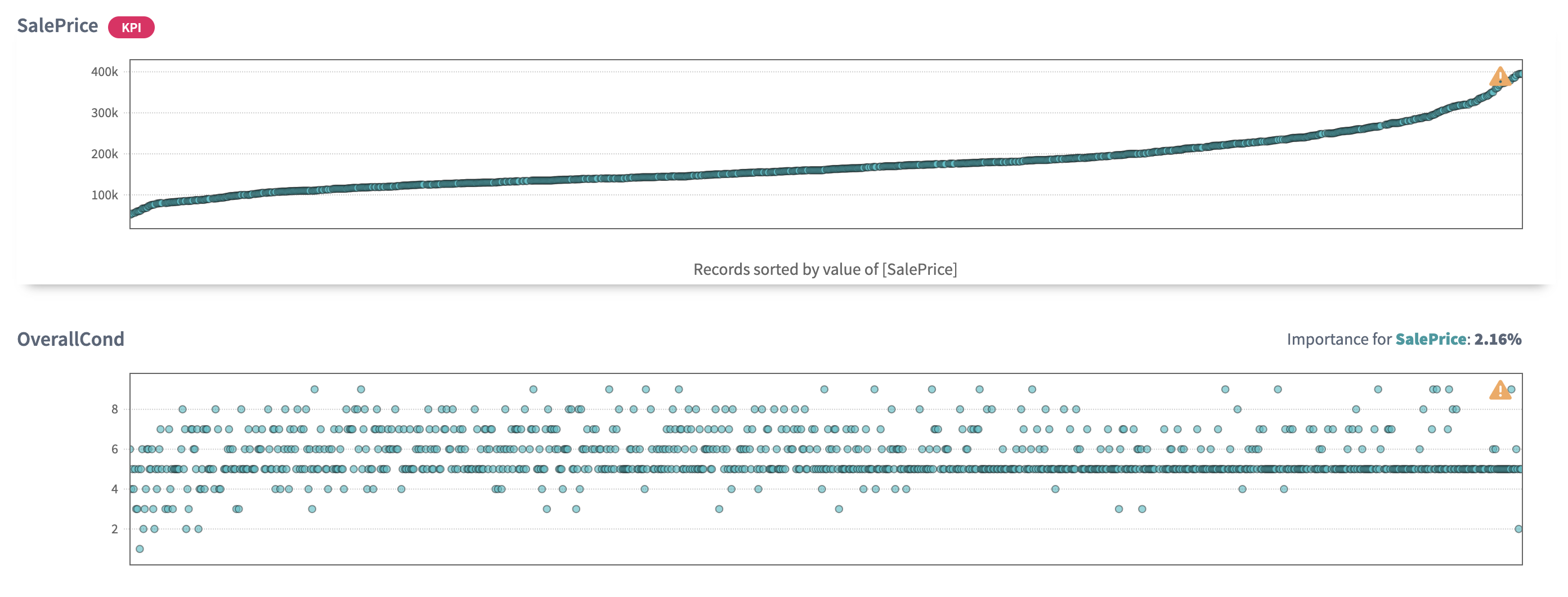
Let's sort the plots by
SalePriceand let's assume that the 'expensive' houses start with 200k. Then we can observe thatOverall qualityincreases together with the growth ofSalePriceand the same trend is observed forGround leaving area:The tendency by
Garage carscapacity is higher for houses with 2 and 3 cars, and cheaper options for houses with 4 cars.And the strange fact that
Overall conditionfor the most expensive houses demonstrates the highest concentration at 5 (which is average). Why? This is an open question raised by data visualisation for further observation. Being interested to sell my property, I really need to explore this not obvious conclusion.
But it not always happens when you see clear and good presented relations between your variables. For example, no relations between the drivers themselves is usually good: that means the model has picked up drivers that are independent from each other, so you can control and change them independently. It’s always easier to take simple changes than complex and multiple ones at once.
Sorting by
Overall qualityshows the increase inGround living area. Could it be that the same (richer) people could afford both expensive materials and bigger area of the houses?
12.Conclusions
To conclude, let's summarise some of the results we have achieved with the DataStories platform.
We have examined all the variables and have looked at their relations
with the KPI - SalePrice.
The 8 features were found as the most important to predict the sale price of the house.
Insights with respect to SalePrice are as follows:
- Houses with higher Quality materials and Conditions are intended to have higher price.
- Houses with places for two and three cars in garage are in a higher demand and are sold in a higher price.
- Houses that have greater
Living areaand biggerBasement square feetalso show the trend to higher price.
These insights can be further formulated into actionable recommendations to be applied to achieve a certain goal.