Binary classification
Binary classification is the process of predicting one of exactly two possible values.
Some questions have yes-or-no answers. For example, if we take customer churn problem in a telecom company, where we want to prevent current and future customers from leaving our service, we are looking at the old customers who have already churned and trying to explore the factors of influence on their decision.

If we have a collection of customers data (like the one in Sample data set section), we may try to explore the data and make some conclusions and find a strategy.
In the Churn data set, an object (or observation) is a telecom customer at certain moment with its transaction data (duration of calls, charges per service, type of plans and some other data):

The results of the observation of customers (churned or not) can be described as 'positive' and 'negative':
- Positive: the observation tells what we are looking for ('true', a customer churned)
- Negative: the observation tells what we are not looking for ('false', a customer did not churn)
Note, that positive and negative here don't mean the emotional attitude to the classes of the KPI. Sometimes it might seem confusing (in our example we use positive class to mark the churners), but in data science these classes are more of formal nature than of emotional one, although often they can coincide.
And as we explore customers churn, we want to be likely more focused on positive result (churned) than on a negative (did not churned) to understand the factors causing churn and have a chance to prevent customers churn in advance.
Since Churn column has only 2 possible values and it's our KPI,
we are now going to explore the binary classification problem.
The goal of the analysis on churn prediction is to find the answers
for following questions:
- What customers will leave with a high probability?
- What is a value of a certain customer?
- Should we offer specialized incentives to this certain customer to retain his loyalty? Is there profit to keep this customer?
- Which method of marketing campaign should we apply to this certain customer?
We create our Churn prediction story with the following configuration:
- We've chosen all the columns as inputs;
- We've selected
Churncolumn as the KPI; - We've set 3 number of run iterations;
- The outliers elimination option stayed
ON.
If the process of creating a story is not clear for you yet, please refer to our Create Story guide to get used to the story creation process.
Once our story is ready, we can see a brief summary of story parameters on Your Stories page: the dimension of columns and rows used, date of story creation (or date of sharing in case the story was shared with you), name of the author. Also general story results are displayed here, they are: model accuracy, KPI name, names of the drivers and importance of each driver derived by the model.
Below we can see, that Churn prediction story has got 5 driving variables. The AUC - one of the most important metrics for binary classification problems - got value of 90% which is pretty high.

Click the story name to access the results.
1. Summary
Here you can see the contents of the whole story analysis. The story consists of 12 slides. Below we'll briefly cover each slide.

Every slide features a thumbnail you can use to browse easily through the story:

2. Data Overview
On the Data Overview slide you can find the high-level summary of the uploaded data set. Here you can observe:
- Row count - the number of records in the uploaded data
- Column count - the number of columns in the uploaded data (together with the KPI column)
- Total count of cells - the number of cells found in the uploaded data
- Percentage of missing cells represents the fraction of missing cells in the total cells number. The less this value is, the better.
- Number of far outliers found - if the option Eliminate far outliers was
ONbefore starting a story, this cell will display the total number of the values in your data set, that were far or not typical for the observed values. (See also statistical outlier.)
The summary table also represents how many variables (columns) of each class we found in the uploaded data. A simple check: the sum of these numbers should give you a value presented in Column count.

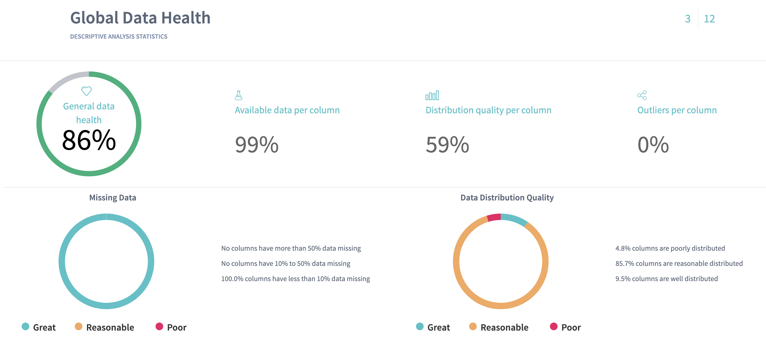
3. Global Data Health
On the Data Health slide you can observe the statistics for the columns of your data. Here we define the metrics about your data that can provide you with the information about "how good" your data is.
Here we present:
- Available data per column - the average fraction of non-missing data per column. The more this value is, the better.
- Outliers per column - the average fraction of statistical outliers found per column. The less this value is, the better.
- Distribution quality per column - how well in average the data is distributed all over the domain. The more the value is, the better.
Read more about data distribution and statistical outliers.
You can also notice a proportion of missing data (the greater a green area of circle is, the better) and a statistics on how your data distributed (the greater a green area of circle is, the better model will be built).
Data health statistics on Churn prediction shows that the data is quite good:
- it has no missing data: the available data is 100% per column
- it contains few outliers in average - 1% per column
- in average the data is reasonably distributed - 58,8% per column.
On this page we summarize and visualize your data using the table. You can have a look at your data from a statistician point of view: see histograms and distribution quality per column, summary statistics such as box plot or statistical outliers or number of unique values for each variable in the data set.
You may note that Number of voice mail messages have a spike on the length, and that most of the NUM variables seem to be normally distributed (show symmetry), except for Total international calls and Customer service calls, which are left-skewed:

However, the usual type of histogram (as those in the table) does not help us
to determine whether the variables are associated with the target variable
Churn. To explore whether a variable is useful for predicting the target
variable, we should go further through the slides.
The median value for Number of voice mail messages is zero. That indicates that at least half of all customers had no voice mail messages:

4. KPI slide
This slide contains the information about your target column.
For binary classification you can observe the histogram of the KPI's distribution: you can see the proportion of values in your target variable. Usually, the data scientists prefer the classes to be balanced: that means it's better when both classes contain approximately the same number of values. This helps to avoid building a model which will prefer to predict one class over another due to the obvious dominance of a certain class.
This problems becomes more critical in some medicine cases, for example when you want to explore the factors that cause a rare disease. Thus, in your data you can have a single record where you observe the disease, and all other records don't contain the disease. That means, the model might never learn from such a data, because it will find this single record not sufficient.
To solve the problem with one dominant class of the binary KPI, there are some common recommendations. One of them is to copy the rows with the lower class and balance both classes in such a way by putting the copied rows into the data. You can easily do this with Excel.
The histogram shows the counts and percentages of customers who churned (true) and who did not churn (false). Fortunately, only a minority (13.9%) of our customers have left our service. Our task is to identify patterns in the data that will help to reduce the proportion of churners:

On this slide you can also observe the plot of KPI values, displayed as they appear in the data. Analysing a regression problem might give you more information from this plot.
For binary classification problems this plot doesn't make a lot of sense, although sorting by the KPI values you can notice again that most of your KPI values are concentrated in False class.


5. Simple Correlations
This page will show you the relationship between the variables.

Before going to search for connection of your variables to the KPI, we check how the columns in your data are connected to each other. It's important to notice some relationship between the variables, because you can either find some new unexpected relationships in the variables or to prove the known ones.
Based on this information, for example, you can decide to go into another iteration of analysis with using only independent variables, because all others are strongly connected to each other.
Sometimes you can find the variables that represent the same measurement, but given in different units (as example, weight in grams and kilograms).
DataStories platform explores two types of relationships between the variables: linear correlarion and mutual information.
By choosing the linear correlation or mutual information tab, you will see the relationships, found between your columns. Read in our glossary about the linear correlation or mutual information.
In Churn prediction story we can see, that the following variables have very strong (98%) linear relationship:
- Total day minutes and Total day charge
- Total night minutes and Total night charge
- Total evening minutes and Total evening charge
- Total international minutes and Total international charge
Use the slider to adjust the strength of shown relationships. The plot will show the connections with the chosen strength and higher. 100% strength will display only the strongest connections (if there are any).
The plot indicates that Total day charge is a simple linear function of Total day minutes and we should probably eliminate one of the two variables from the analysis, because the correlation is perfectly linear.
Tips:
- Hover over a variable’s name or a connection to highlight it,
- You can drag the plot to rotate it.
One should take care to avoid feeding highly correlated variables to predictive models. At best, using highly correlated variables will overemphasize one data component; at worst, will cause the model to become unstable and deliver unreliable results. However, just because two variables are correlated does not mean that we should omit one of them.
The Churn prediction story gives us the following mutual relationship:
The relationship between the variables is the same as linear, but some mutual information is shown between the KPI Churn and other variables. You can observe, that mutual information of the KPI covers both Total day minutes and Total day charge as these variables are linearly correlated.
Tips:
- Use Additional settings to adjust the radius of a circle, set the text size and capacity or hide unconnected variables,
- Use Search field to find and highlight the necessary variable.
Configuration of additional settings:

6. Pair-Wise Plots
Once we had a look at the variables' relationships and found the connections, we can go further to observe in details their pairwise behaviour with using a scatter plot.
On pair-wise plots the DataStories Platform shows all the variables versus the KPI, ordered by the mutual information with the KPI.
Click on the name of the variable to build the corresponding scatter plot.
The scatter plot of Total day minutes shows that high day-users tend to churn at a higher rate (as the Churners dots have a significant skew to the right). So we can conclude, that:
- We should carefully track the number of day minutes used by each customer and as the number of day minutes passes 315, we should consider special incentives, as we see from the plot that only churners stay when we go higher this threshold
- We should investigate why heavy day-users are tempted to leave
- We should expect that the predictive model will include day minutes as a driver of Churn.

The scatter plot of Total evening minutes shows a slight tendency for customers with higher evening minutes to churn (as the Churners dots have a slight skew to the right):
By analysing the scatter plot, you have a chance to find predictive behaviour for some variables and mark some potentially dangerous areas within your observations. It also might be, that the plot won't show any regular relations in the variables.

From the plot we cannot conclude for sure that such an effect exists, but still we have an alert about evening cell-phone users, until the predictive model shows the effect is in fact present.
7. Linear vs. Non-linear relations
The Linear versus Non-linear slide represents a bar-chart, where you can observe linear correlation and mutual information next to each other.
Comparing these two values for each variable might give additional insights into the complexity of your problem.
The dependency for mutual information is more complex than for linear correlation, that’s why variables are not always linearly correlated if there is mutual relationship between two variables.
On the plot below we can see the top eight variables, that show the highest dependency of the KPI. But responding to the previously found connection between the variables, we can conclude, that Total day minutes and Total day charge represent the same behaviour, because they are strongly linearly correlated.
The same for Total evening minutes and Total evening charge, Voice mail plan and Number of voice mail messages:

Some variables can show no linear correlation to the KPI, but they still can be related to it with mutual information, so you can not eliminate these variables. DataStories analyzes all the variables to detect whether they are connected to the KPI.
On the plot above you can also notice, that Total international calls variable doesn't show linear correlation to the KPI Churn, but it shows to have 6,1% of mutual information. So the dependency exists and we should explore it.
8. Driver Overview
So far, the story covered the descriptive analytics. The Driver Overview
slide starts the section of predictive analytics, delivered by the DataStories
platform. Here you can see, which variables the model has picked up as
important to predict the selected KPI.
On the slide you can see the driving features, drivers, ordered by their importance.
For Churn prediction it shows that the model has chosen 5 variables important to predict
Churnwith 90,9% AUC. It looks like Customer service calls was chosen as the most important factor (34,3%) that has impact on customers' decision to churn, but from this plot we can not identify the type of the relation. It might be a rather complex dependency:
As we can see, the model didn't choose the pair of perfectly correlated variables we observed before (such as Total day minutes and Total day charge), but chose one of them.

Analysing the slide, we also can conclude that the model has picked up 5 features out of 20 inputs, what is good - usually, the more parameters the model includes as important ones, the higher possibility for the model to overfit.
The model with 5 significant variables out of 20 seems to be actionable: that means, that with high probability you will be able to control and influence each of these 5 given features in your problem.
The Driver Overview slide shows the AUC and the accuracy of the built model. Look at this parameters to check the model: of course, the exact values for the conclusion may differ from problem to problem, but on average you can claim that if the accuracy is not high (lower than 65%), then probably your data is not enough to built a reliable predictive model. That indicates, you should try to find additional sources of data: take more experiments and collect more observations. Probably, you might decide to look for additional features, useful to observe and include into the analysis.
On the other hand, you should critically assess the model that performs too
good (with accuracy 99% and higher) on your data: you should carefully explore
the drivers and analyse, whether the model has picked up tightly related
drivers to you KPI. In this case,
you won't be able to monitor and track the drivers and, therefore, to control
the KPI. Such a drivers should be eliminated from the further analysis.
Imagine, if the Churn data set contained a variable Number of calls per last 3 months and the predictive model would pick up this variable as a driver. But this feature itself can be interpreted as the KPI (because it has pretty similar behaviour): the chance is pretty high, that a customer who did not have calls for last 3 months, had churned, and the customers who did have the calls had not left our service. Moreover, you can not control such a variable: you can not afford customers to have more calls in current conditions. You can only increase their loyalty to your service with changing the other parameters.
9. What-Ifs
On the What-Ifs slide you can study the influence of the drivers on the KPI in more details, by changing their value underneath the plots.
The first usage of What-ifs plots is a monitoring of a certain driver on the KPI. To interpret the plots correctly, when changing one driver value, you should keep the same values of all other drivers.
For example, by changing International plan from No to Yes we can see, that the customer is intended to churn (with given configuration of other drivers). Perhaps, we should investigate what is it about our International plan that is inducing our customers to leave.
For classification problem the model calculates the confidence (precision) and uncertainty for the KPI prediction.
You can see that with given configuration of other drivers, the customer with International Plan will leave our service with 97,30% confidence. This is very high.

By changing the parameters of the drivers, you also change the value of confidence, delivered by the model.
For example, by setting the International plan to No and a small amount of evening calls, the model predicts a negative outcome for Churn, with 96% precision.

Please, keep in mind that the observation of the prediction while changing a driver is only relevant for the specific configuration of the other drivers.
A slight variation of the Total evening calls shows that the predicted churn outcome is now positive.

The What Ifs slide is a useful tool to explore the impact of each driver configuration over your target KPIs.
10. Model Validation
This slide shows you more detailed information about the model accuracy.
While solving a classification problem, the DataStories algorithm produces continuous scores for each record of your data. At the same time, the model chooses a threshold, and according to the given score and a threshold, each record of data is classified into the certain class of your KPI. Given confusion matrix represents the quality of the classifier.
In top right and bottom left corners you can see a number of records that were predicted correctly for each value of the KPI.
We can see, that the model predicted correctly 87,2% (1606) customers who did not churn, and 83,2% (233) customers who did churn, which is good:

You always need to think about the interpretation of the results in terms of your certain problem: what information can you extract from the values the model delivered you? You might decide to act in a specific way after looking at the numbers. You can find some misclassified by the model records and you should decide, what sense they make in your certain problem.
We also observe, that some records were misclassified and now we should decide, what value we can extract from this given information.
The easiest way to decide (for example, if you're solving a business problem) is to apply some calculations and estimate the economical effect of the needed actions.
In given Churn prediction problem, we can compare the total income in case we are going to retain customers, who are predicted to churn, when trying to influence them (for example, the cost on marketing campaign), and our total income in case if we decide not to act.
Below there is a very simple example of calculations with the following assumptions:
- We know, that income per each customer is 10 EUR per year
- We know, that the cost of marketing campaign is 0,5 EUR per customer (for example, we decided to send customised sms to each client, who was predicted as churner).
In case we don't act:
We have a total actual income of (233 + 1606)* 10 EUR = 18 390 EUR - this is the income we get from all the 1839 customers, who did not leave our service. Others 283 (47 + 236) left and we decided not to retain the predicted 236 customers, thus we don't get any income from them (at the same time we don't have any costs).
In case we do some actions (send out personalised sms to customers, predicted as churners):
The income of non-churners doesn't change (18 390 EUR), but we have some extra costs on the predicted churners: 469 (233 + 236) customers - as agreed, we are going to send them out personal sms and spend 0,5 EUR per each customer. So, the cost of retention is 469*0,5 EUR = 234,5 EUR. It's logical to assume, that not all of 236 customers will react on our actions: let's expect only 40% of them (i.e 94,4) will stay, others 60% will leave in spite of this action.
Thus, the total income will be 18 390 EUR + 94,4* 10 EUR - 234,5 EUR = 19 099,5 EUR. This is higher than in case we don't act.
The given calculation for this particular problem shows, that with the given model our best strategy will be to get in touch with those customers, whom the model predicted as churners.
After the analysis of confusion matrix, you can upload the test data to validate the model (to check, how model performs on unseen data).
Upload the validation data directly to the slide:

If your training data was enough and relevant to build the model, then the testing data should give approximately the same results on confusion matrix and show the close metrics. That indicates, that the model has learnt the patterns, but not the exact properties of given data (so the model is not overfitting).
On the Churn prediction story we observe almost the same percentages for the testing data. That means, the built model is reliable:

11. Driver Plots
The Driver Plots slide represents the linked plots for each driver, picked up by our model. It’s often useful to explore how drivers and the KPI are changing together in the data.
Very often you can extract more value by sorting the points: either by the KPI values or by any of the drivers.
Let's sort the plots by the KPI value Churn.
Then, for Customer service calls we can observe a triangle in the right side of the plot: for churned customers the number of calls to customer service seems to be higher than for non-churned. That means, we should contact our customer service and find out which problems the customers had reported and whether these problems had been resolved. It looks like the unresolved problems by the customer service could cause the churn of our customers:
For Total day minutes variable we see, that the density of the dots is more intensive to the right. As we learnt from the Simple Correlation slide, Total day minutes is tightly linearly correlated to the Total day charge variable. Perhaps, that means that our day tariff is too expensive and this fact causes our customers, who do a lot of calls during a day, to leave:
The presence of International plan pushes the customers to churn more than those who don’t have it - as we also see the increase of dots concentration in the corresponding area. We should explore, what is wrong with the international tariff and make it more attractive for the customers:


But it not always happens when you see clear and good presented relations between your variables. For example, no relations between the drivers themselves is usually good: that means the model has picked up drivers that are independent from each other, so you can control and change them independently. It’s always easier to take simple changes than complex and multiple ones at once.
We can observe no relation of Voice mail plan and the KPI when sorting by KPI values:

But when sorting by Voice mail plan we can see that the presence of it makes positive influence on customers: those who don’t have this plan, churned more frequently than those who have:
Sorting by Total evening minutes shows us a slight higher concentration of churned customers with higher charges per evening service:


12. Conclusions
To conclude, let's summarise some of the results we have achieved with applying DataStories platform to churn data.
We have examined all the variables, and have looked at their relationship with churn.
The four variables, representing charge, are linear functions of the minute variables, and should be omitted.
Insights with respect to churn are as follows:
- Customers with more Customer Service Calls churn more often than the other
- customers.
- Customers with both high Day Minutes and high Evening Charge tend to churn
- at a higher rate than the other customers.
- Customers with the International Plan tend to churn more frequently.
- Customers with the Voice Mail Plan tend to churn less frequently.
So, we have collected considerable insight about the attributes associated with the customers leaving the company. These insights can be further formulated into actionable recommendations so that the company can take action to lower the churn rate among its customer base.