Multi-KPI analysis
In a multi-KPI analysis, we seek the model different variables simultaneously, using a single model for all.
Performing a multi-KPI analysis might involve classification or regression tasks, depending on the nature of the KPIs selected to be modelled. In this short case study, we are going to cover specificities of multi-KPI analysis. We refer to our case studies on regression and classification case studies, for more detailed examples.
Food processing in general is a challenging topic because of the high variability of the raw materials used, but also because of the variability coming from the production processes. Irrespectively of what we get in, we need to deliver a consistent quality of the output.
Our sample data set takes the use case of a potato baking industry. The question we are interested in, is to find process parameters such that, irrespectively of the feedstock parameters, we achieve golden-brown colour and minimal waste after oven.
For each of the batch, we measure 5 stock parameters (in blue) as well as 12 processing parameters (in purple). We typically don't have control over the feedstock parameters, although we can control the processing parameters. The KPIs of interest are the
Color after ovenand theWaste after oven.
We are thus interesting into minimising
the waste after oven, which is numeric, while
optimising the color after oven. The color we want to reach is
golden brown, which is neither the lightest nor the darkest coloration.
The Color after oven is a categorical variable, but because it's a color scale, we can represent it as a numerical variable Color after oven (numeric) from 1 to 5.
This way it will be possible for the model to capture the ordinal nature of the color scale and it will be possible to see smaller influences, like there could be a transition from color 3 to 4 when the sugar content increases. These behaviour would be way more difficult to understand in a categorical view, as categories would be clipped to their values and we would end-up with a staircase function.
We need to make sure to discard the equivalent categorical variable
Color after ovenfrom the analysis, to avoid the prediction of the numerical feature using the categorical counterpart (ie. create a trivial model).
We create a story with the following parameters:
- We remove
Start datefrom the analysis, as this data is not expected to be relevant - We remove
Average temperature after ovenas the average temperature cannot be controlled in the process. - We remove
Color after ovencategorical variable - We select
Color after oven (numeric)andWaste after ovencolumns as theKPI;
If the process of creating a story is not clear for you yet, please refer to our Create Story guide to get used to the story creation process.
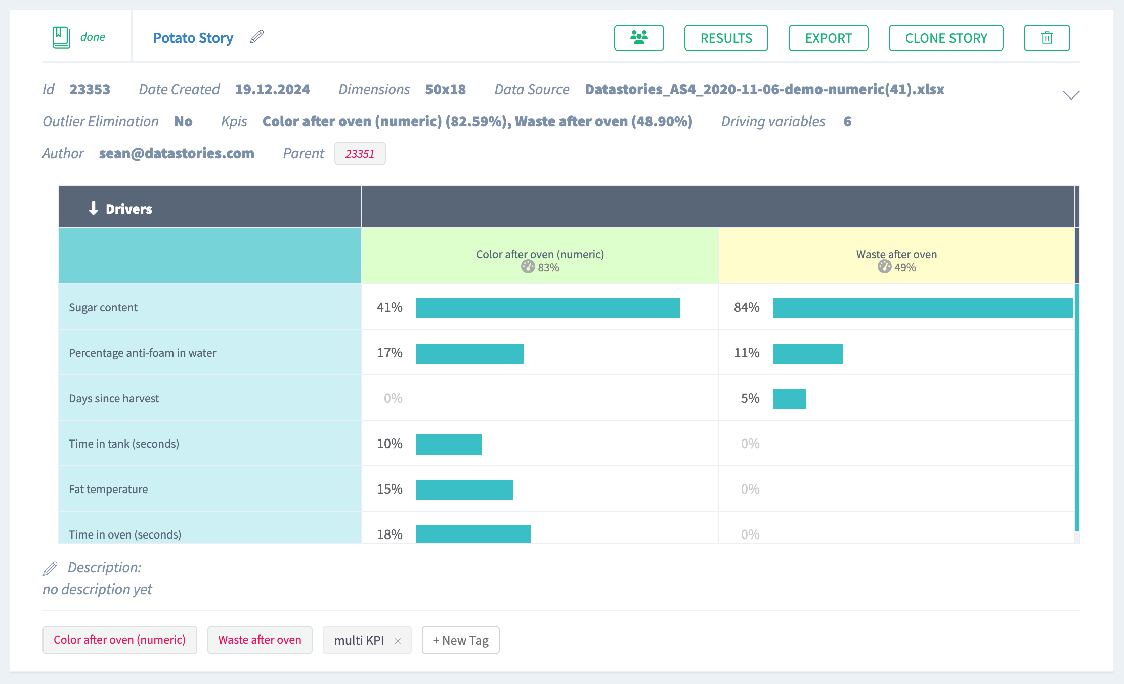
Once your story is ready, you can see a brief summary of story parameters on
Your Stories page: the dimension of columns and rows used, date of story
creation (or date of sharing in case the story was shared with you),
name of the author. Also general story results are displayed here, they are:
model accuracy, KPI name, as well as a driver overview summary.
Click the story name and dive into the slides.
1. Summary
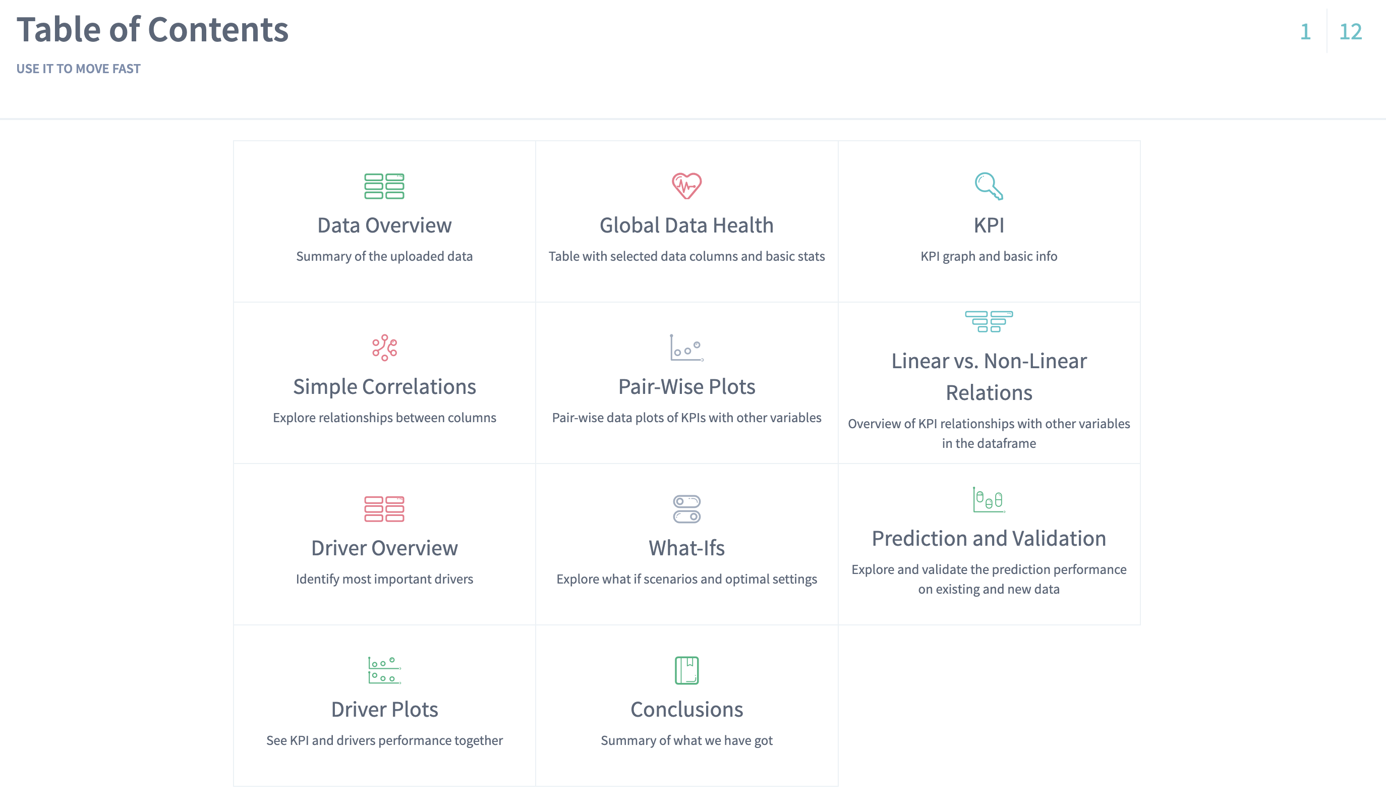
On the first slide you see the contents of the whole story analysis. The story consists of 12 slides.
Every slide features a thumbnail you can use to browse easily through the story:
2. Data Overview
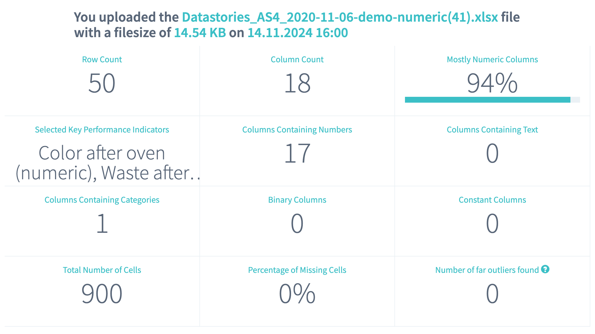
On the Data Overview slide you can find the high-level summary of the uploaded data set. Here you can observe:
- Row count - the number of records in the uploaded data
- Column count - the number of columns in the uploaded data (together with the KPI column)
- Total count of cells - the number of cells found in the uploaded data
- Percentage of missing cells represents the fraction of missing cells in the total cells number. The less this value is, the better.
- Number of
far outliersfound - this cell will show you the total number of the values in your data set that were far or not typical for the observed values (if the option Eliminate far outliers was ON before starting a story).
The summary table also represents how many variables (columns) of each class we found in the uploaded data.
From the given overview you can conclude that the data set contains mostly numerical variables and one categorical column. You can also notice that the data contains no missing values, and no records were identified as outliers because outlier removal was turned off when creating the story:
3. Global Data Health
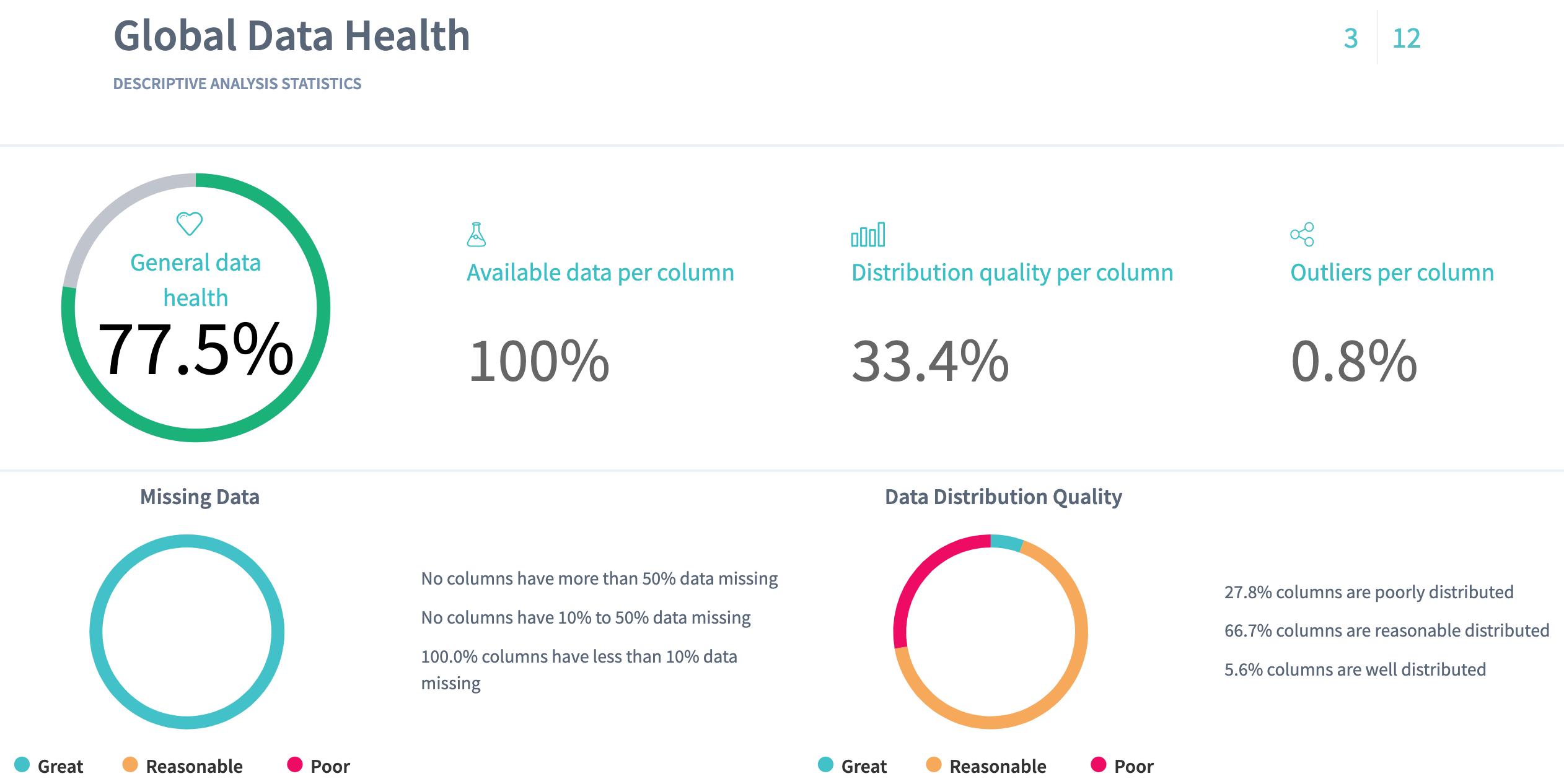
On the Data Health slide you can observe the statistics for the columns of your data. Here we define the metrics about your data that can provide you with the information about "how healthy" your data is.
Here we present:
- Available data per column - the average fraction of non-missing data per column. The more this value is, the better.
- Outliers per column - the average fraction of statistical outliers found per column. The less this value is, the better.
- Distribution quality per column - how well in average the data is
distributed all over the domain. The more the value is, the better. Columns with a bad distribution quality will be more difficult to use to predict the value of the KPIs. For example,
Scraper speedcould be very important in the process, but we mostly saw records where this speed was set to 8, so it will be difficult to predict what will happen when it is set differently.
Read more about data distribution and statistical outliers.
You can also notice a proportion of missing data (the greater a green area of circle is, the better) and a statistics on how your data distributed (the greater a green area of circle is, the better model will be built).
Data health situation on Baking process data reflects that poor data distribution quality of the columns (27,8%) has significant impact on the general health by decreasing it (77,5%).
4. KPI slide
This slide contains the information about your target columns
Waste after oven and Color after oven (numeric).
Here you can observe the KPI values plotted as they appear in the
data. You can use sorting by record number to explore how the areas of
missing data are concentrated in the KPI
or you can see if the data appears in a periodical behaviour: it might be
a signal for you that your data is formed from the same repeated amount of
records.
From the plot below you can conclude that there are no areas of missing concentration and no periodical behaviour in the KPI column:
You can also confirm there is no direct relation between the KPIs, by sorting according to one of them.
In case you enabled the removal of far outliers, you will see that one of the cells (record 20) has been identified as an outlier with respect to the
variable Waste after oven. These records with far outliers are then removed from the analysis.
5. Simple Correlations
On this slide will find the relationship between the variables.
Before going to search for connection of your variables to the KPI, we check how the columns in your data are connected to each other. It's important to notice some relationship between the variables, because you can either find some new unexpected relationships in the variables or to prove the known ones.
Based on this information, for example, you can decide to go into another iteration of analysis with using only independent variables, because all others are strongly connected to each other.
DataStories algorithm groups the variables that represent the same information with the respect to the KPI and chooses only the one with the stongest relation to use further in the analysis.
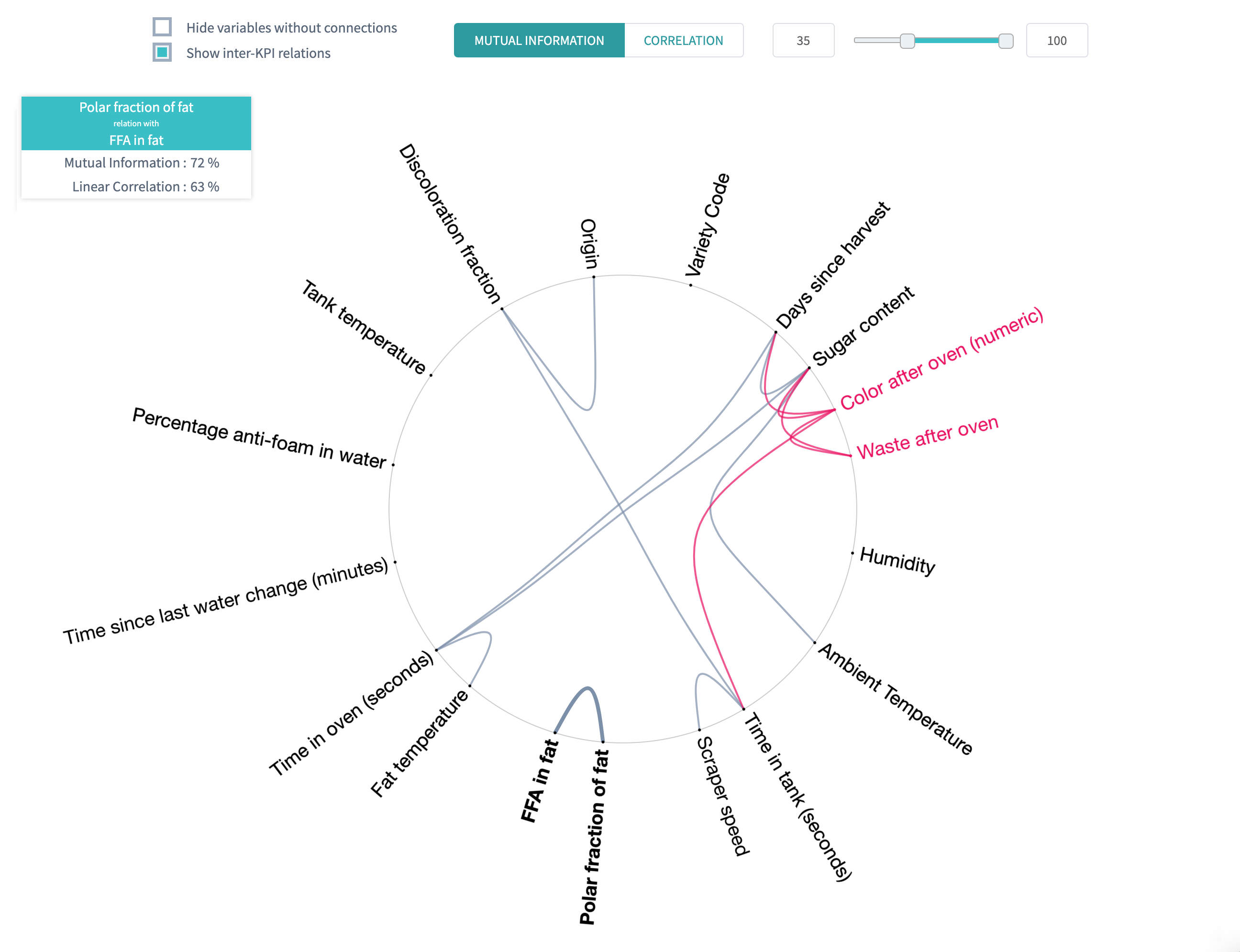
For example, you can see that all variables share a very small amount of mutual information, and are relatively lowely correlated. The only notable exception are the variable
Polar fraction of fat, which has63%correlation withFFA in fat, and shares72%of mutual information.
DataStories platform explores two types of relationships between the variables: linear correlation and mutual information. By choosing the linear correlation or mutual information tab, you will see the corresponding relationships.
Tips:
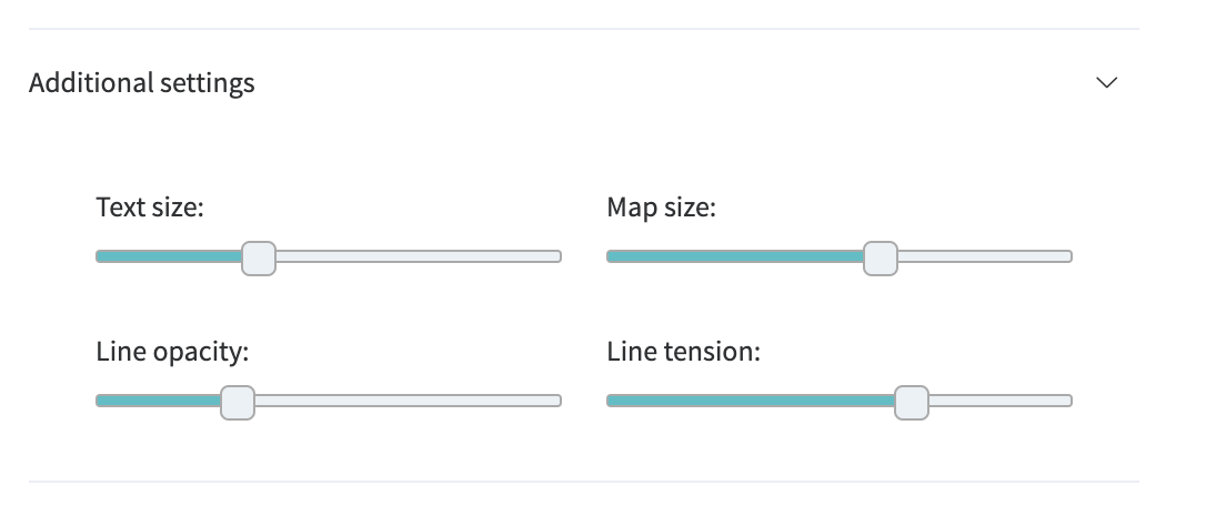
- Use Additional settings to adjust the radius of a circle, set the text size and capacity or hide unconnected variables,
- Use Search field to find and highlight the necessary variable.
6. Pair-Wise Plots
Once we had a look at the variables' relationships and found the connections, we can go further to observe in details their pairwise behaviour with using a scatter plot.
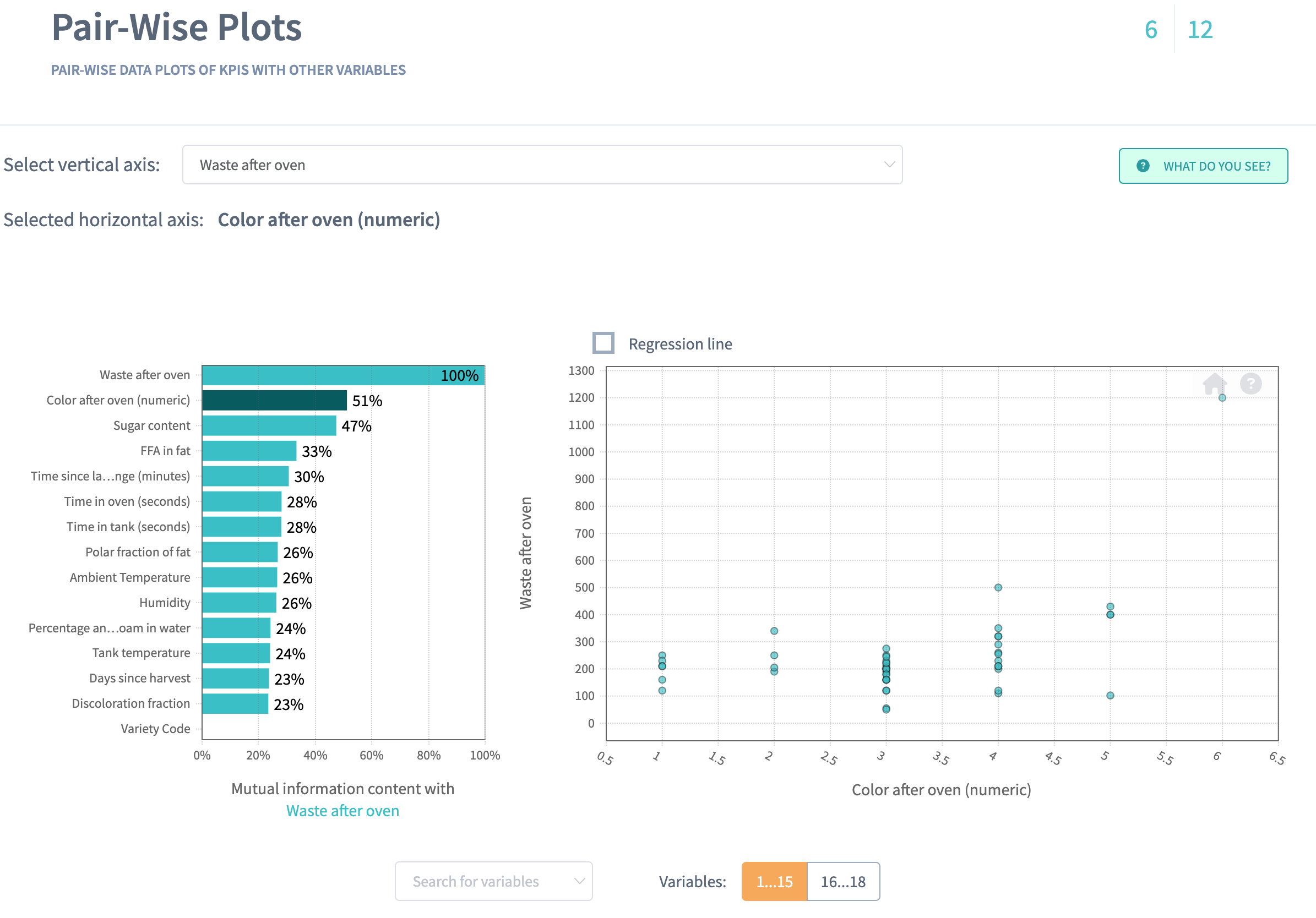
On pair-wise plots you can explore all the variables versus the KPI, ordered by the mutual information with the KPI.
Click on the name of the variable to build the corresponding scatter plot.
The scatter plot of
Waste after ovenagainstColor after oven (numeric)shows no particular relation between thoseKPIs:
By analysing the scatter plot, you have a chance to find predictive behaviour for some variables and mark some areas of interest within your observations. It also might be, that the plot won't show any regular relations in the variables.
7. Linear vs. Non-linear relations
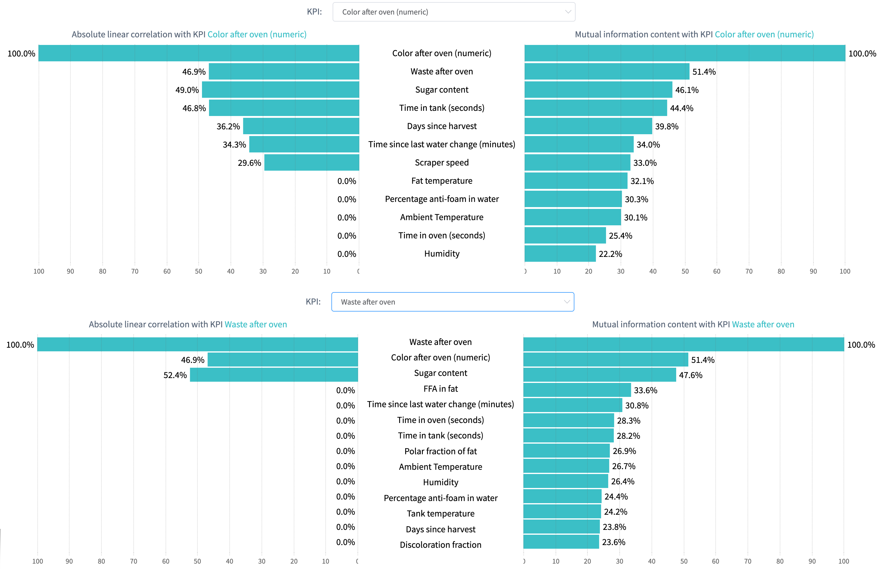
The Linear versus Non-linear slide represents a bar-chart, where you can observe linear correlation and mutual information next to each other.
Comparing these two values for each variable might give additional insights into the complexity of your problem.
The dependency for mutual information is more complex than for linear correlation, that’s why variables are not always linearly correlated if there is mutual relationship between two variables.
Some variables can show no linear correlation to the KPI, but they still can be related to it with mutual information, so you can not eliminate these variables.
DataStories analyzes all the variables to detect whether they are connected to each of the KPI:
Tip: use search field to leave only the most interesting variables on the bar chart.
8. Driver Overview
So far, the story covered the descriptive analytics.
The Driver Overview slide starts the section of predictive analytics,
delivered by the DataStories platform. Here you can see, which variables
the model has picked up as important to predict Color after oven (numeric) and Waste after oven.
How does DataStories make a decision on which variables to choose?
We don't try to deliver you the most complex model with 100% accuracy. Why? Because such a model won't be actionable. The goal of the analysis is to derive a model you can control and act on. That's why our algorithm is developed and trained to choose the optimal combination of complexity and quality: so that with the further increasing of model complexity, the increase of the quality would be insignificant.
On the slide you can see the driving features, drivers, ordered by their importance.
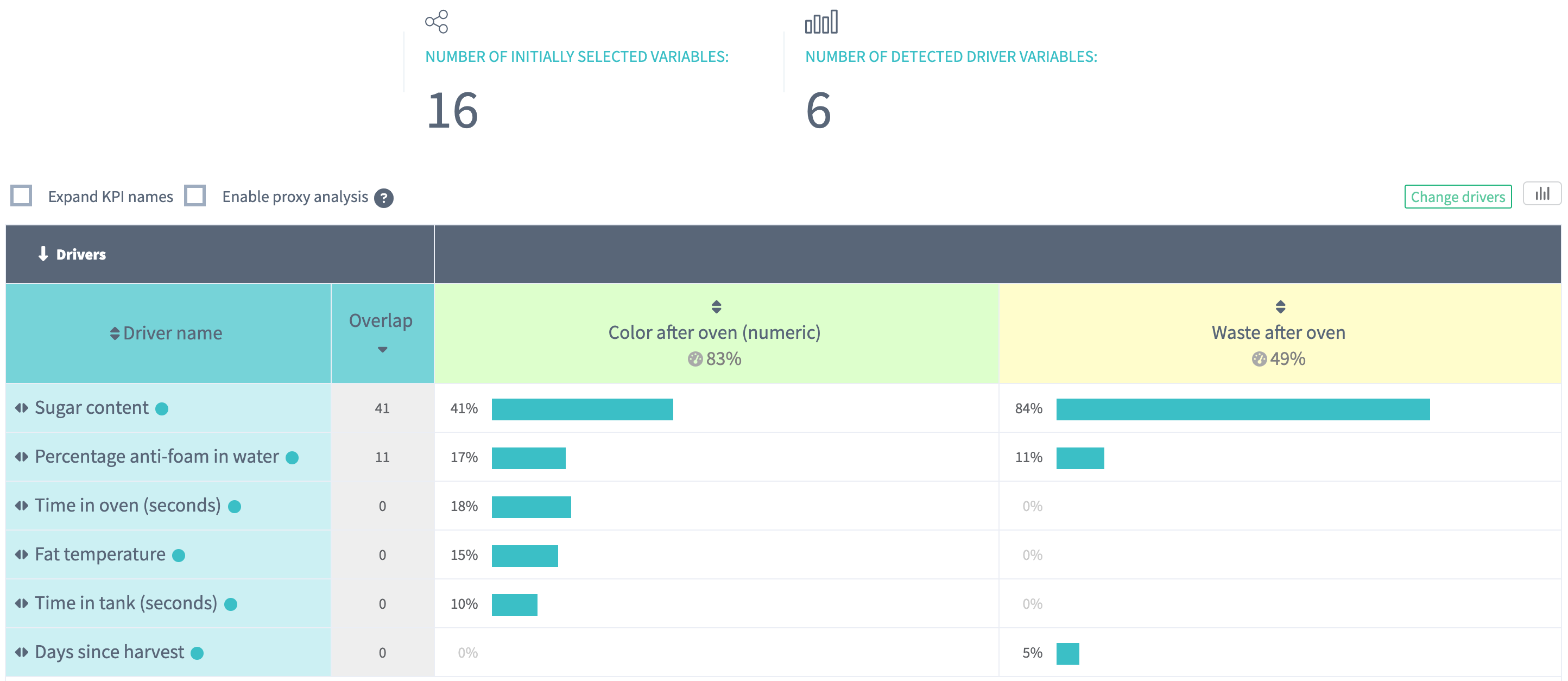
The chart demonstrates that the model chooses 6 drivers to predict both KPIs, with
83%(Color after oven (numeric)) and49%(Waste after oven) correlation between the predicted and actual values. accuracy.We might observe the
Sugar Contentdriver is the one with the most importance and plays a role in explaining both of the KPIs. TheColor after oven (numeric)is driven by a total of 5 drivers, andWaste after ovenis driven by 3 drivers.
9. What-Ifs
On the What-Ifs slide you can explore the behaviour of the KPI while
changing the drivers value underneath the plots.
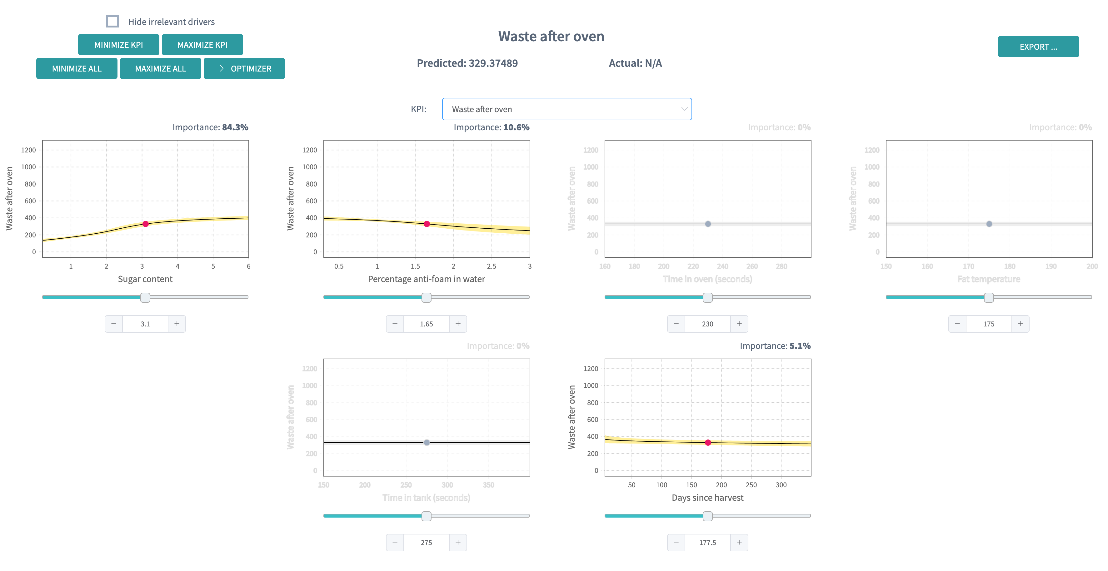
Each plot demonstrates the dependency of the
Color after oven (numeric)from each driver:You can have the counterpart for
Waste after ovenby selecting it as the KPI of interest:
With a change of a driver value, the KPI will change
according to the model behaviour.
You can also decide to minimise or maximise the KPI, but the most interesting part
happens when you decide to optimise your KPI under some constraints.
In our case, we would like to guarantee fries of colouring 3 (which corresponds to our desired golden brown colour) and minimise the waste. We could also ask to minimise the uncertainty of those variables. Remind that since we made the
Color after oven (numeric)an actual numerical variable, we can give some interval constraint, which would be easier to achieve that an perfect equality.In our case, the solution shows optimal configurations for our KPIs:
We can observe that we could still modify a bit some drivers (for example,
Fat temperature) without modifying the waste we produce, and lower slightly the colouring we achieve.This suggests that we could refine our optimisation target to lower our upper bound and make it closer to 3. Some interesting questions would be to know whether or not we achieve a good uncertainty, and if the error margin is worth the change.
Going further
This shorter case study focuses on specificities of Multi-KPI analysis. For further information about the slide and tools we deploy on our platform, please refer to the other case studies on categorical classification or regression task.
