Glossary
Data Story
A Data Story is the result of our analysis on a data source that discovers predictive relationships and dependencies between the KPI and input variables. Looking at the results of your Story you can answer different types of questions about your data and define the direction for further analysis. The outcomes of this process are:
- Data overview - basic statistics about data
- Global Data Health - data distribution summary
- KPI overview
- Simple Correlations, Linear vs Mutual Correlation - relationships between the variables in your data
- Visualisation of relationships in your data with Pair-Wise Plots
- Driver Overview - a summary of the predictive power of each driver relative to each KPI
- KPI behaviour while changing the drivers with What-if plots
- Prediction and Validation - the analysis of the model performance and quality
- Performance of KPI and drivers together on Driver plots
- Conclusions of the analysis
You can see all your stories if you go to Your Stories section:

Data Source
A Data Source is a table containing the rows records, observations and columns variables, inputs, features, attributes, on which Story is based. A data source is also known as a data set. Before modelling, the original data set is usually divided into two parts:
- Training set - the data used to discover predictive models. In general, a random sample of 80% of the original data is taken as the training one. The training set is used for creating a story and finding the training model.
- Validation set - also called the testing set, the data used to test a discovered model. This is the remaining 20% of the original data. This set can be used on the Model Validation slide of a story to check the quality of the discovered model.
You can see all the uploaded data sources if you go to Data Sources section:

Variables
Also known as features, measurements or attributes. They are the columns of a table in the original data source.
KPI
The Key Performance Indicator. It is one of the target variables that you want to predict by using other variables. The model that is built during a story, will use the other selected columns of your data to predict the value of the chosen KPIs and find which of the columns have the most impact on the chosen KPIs.
Inputs
The variables from which you want to be able to predict the
KPIs. You can select the variables you want to use as inputs when
creating a story.
The KPIs are not counted as input.
Data Summary Table
The Data Summary Table is one of the reporting tool we give you to explore the distribution of your data set.
You can find it during story creation, as well as in the Data Health slide of each story.

Histogram
A histogram is a representation of a variable’s distribution. This allows to inspect a variable for its outliers or skewness.
- To construct a histogram from NUM variable, we split the data into intervals, called ranges. For each range we show how many values of a variable lie within this range.
- To construct a histogram from CAT or BIN variable, we just count how many records there are in each category for a variable.
- Histograms are not available for TXT variables.
You can observe histograms on the Data Summary table.
Box plot
A box plot is a graph that gives you a good indication of how the values in the data are spread out. It is useful when comparing distributions between many groups / categories presented in the variable.
A box plot below is used to analyze the relationship between a continuous variable Total day minutes and a binary variable Churn. Using the graph, we can compare the range and distribution of the Total day minutes for churners and non-churners. We observe that high-day users tend to churn at a higher rate:
The above box plot can be found in the pairwise plot.
A box plot also tells you if your data is symmetrical, how tightly your data is grouped, and if and how your data is skewed, based on a five number summary:
- median value is such a value, that 50% of your data are less and 50% of your data are greater than this value,
- first quartile is such a value, that 25% of your data are less and 75% of your data are greater than this value,
- third quartile is such a value, that 75% of your data are less and 25% of your data are greater than this value,
- maximum - the maximum value in your data set,
- minimum - the minimum value in your data set.
You also can observe box plots on the Data Summary Table:
Outliers
We differentiate between statistical and model-based outliers.
- A statistical outlier is an observation value that is distant from other observations or not typical for them. An outlier may be due to unexpectedly high variability in the measurement or it may indicate an experimental error. An outlier can cause serious problems for modelling: the results of the analysis can be incorrect due to the influence of non-standard records that appear in your data.
Imagine, that you have Age column in your data, which represents the measurements of students between age 12 and 17, and suddenly you find a value of 112 in the column. You can easily decide, that this is either a typo, or an incorrect value, which is for sure not typical for your data. You should remove this value, because it will affect the results of your analysis.
In general, in your data columns you can logically detect as outliers either too little values or too big ones.
By looking at the outliers indicator on the Data Health page you can find some critical data quality issues. For example, if you see non-zero value for the number of outliers in column X, you can go to your data source and sort the records by this column X. Next you need to check if the smallest or the greatest values in this column after sorting make sense for you. It might be a typo, so you need to correct it and upload fixed data to the platform again. Usually it improves the analysis.
Be aware that the data presented in the Data Health are data that entered into account during the modelling. Therefore, if you have chosen to remove outliers, there will be no outlier left in your model data.
But what if your case of study is not so obvious and you can not logically conclude the value being an outlier? In more complicated cases, the outliers can only be determined statistically. In this case, you cannot do it manually. That is why, in order to avoid the influence of found outliers on the modelling, we provide an option to exclude the statistical outliers from the data and replace them by missing values. Read Create a Story section to learn how manage outliers elimination option.
If you have chosen to eliminate outliers from your story, then the pairwise plot can be used as a tool to inspect outliers removed from the data.

- A model-based outlier is a predicted value of
KPIthat is exceptionally distant from its actual value, i.e. the prediction error is especially large. This identifies special cases where the model does not perform well.
Highlighting of the model-based outliers is available on ModelValidation slide.


Data distribution
This metric shows how well the data is distributed within the assumed domain (also known as input-output space, where input stands for variables and output for the KPI).
It's very useful to know whether your data covers the whole domain in a representative way, and this metric tells you more about "how healthy" your data is. When your data distribution quality is poor, it might be the reason why the model doesn't perform well in some areas of the data (these areas are called areas of high uncertainty).
Imagine, that you interview the people on the street during working hours, and due to this condition the age of these people will be mostly above 60 (because younger people are at work). You can probably observe only several people with the age below 60. When you build a model based on this kind of data, this model will perform bad on the people aged below 60 - the uncertainty for such a model will be high. Thus, usage of data with low distribution quality could cause a problem for modelling.
You can see the value of this metric on the Data Summary Table.
Data distribution per column shows if your data is evenly distributed along one of the variables. Poor distribution of the data makes the interpolation quality of the model lower. When you see, e.g, a column X with poor distribution, it might indicate that the analysis might be improved by collecting more data for the categories or values of this column X that are rarely presented in your current data set. Enriching the data set this way will help to increase the quality of the analysis.
Tip: In the Data Health slide, click on the circle histogram to filter the variables by the distribution:

Linear Correlation
A Linear correlation between two variables x and y indicates that an increase in x is associated with either an increase in y (positive correlation) or a decrease in y (negative correlation).
The linear correlation coefficient from -1 to 1 (or percentage value from -100% to 100%) defines the strength and direction of the linear relationship between variables.
For example, the more area of you house is, the more energy consumption is (positive linear correlation) and the less the EPC score is (negative linear correlation).
Tip: The pairwise plot can display a linear regression between one of the KPI and any other feature. This relation does not account for outliers that are removed from the modelling.

See also Mutual information.
Mutual information
Mutual information identifies more general type of relationship than a linear correlation. The proportion of dependency is more complex than direct proportion. Mutual information also identifies linear relationship. In other words, if variables are linearly correlated, then they will also show positive mutual information. But the opposite is not always true: variables with positive mutual information are not necessarily linearly correlated.
The coefficient from 0 to 1 (or percentage value from 0% to 100%) defines the strength of mutual information between variables.
DataStories Platform provides Linear and Mutual relationships between the variables:
As well as Linear and Mutual relationships of each variable with the KPI:

Scatter plot
A scatter plots is a way of data visualization, that can bring you a lot of information.
A scatter plot is a two-dimensional plot that uses dots to represent the values of two different variables - one plotted along the x-axis and the other plotted along the y-axis. Scatter plots are used when you want to show the relationship between two variables. Sometimes they are called correlation plots, because they show how two variables are correlated.
Scatter plots are very useful for observing the relationship between two variables, but you need to know how to use them and interpret them properly.
For example this scatter plot shows the relationship between the variables - when the DragCoef decreases as Airspeed increases. Notice that the relationship isn’t perfect, but the general trend is pretty clear:
This scatter plot shows no relation between Airspeed and PrimSep8 variables:

Drivers
The most important variables, that have the most significant impact on the
prediction of your target column - the
KPI - and found by the DataStories
algorithm.
Each column of the Driver Overview the table represents a KPI, and each row represents a driver:

You can create a new story with modified drivers, by clicking the
Change driversbutton and selecting replacement drivers.
Predictive Model
The DataStories platform performs a complex feature selection algorithm for
building a model and getting a prediction. By taking all the inputs into
account, the algorithm iteratively selects only those variables
- drivers - that together can give the most accurate model.
- Strictly speaking, a model is a mathematical function (or formula),
- that represents the dependency of the KPI from the discovered drivers.
To get the models built by the DataStories platform for further investigation, you can download them in any available format from the What-ifs slide.
Models exported in the DataStories format can then be imported using the DataStories SDK. Typical use cases could be the deployment of those models via MlFlow (see our developer help) for an example.
To understand how well your model performs on your data, you should check performance metrics.
Prediction
Predictions are derived by DataStories algorithms and it’s the result of
applying the discovered model to the values of the driving variables.
In case the target – KPI – is missing, its prediction would be the
best guest we could make based on the discovered model.
To get the prediction of seen records of training data or unseen records of validation data, get the file by clicking
Downloadbutton on Model validation slide.


Model Validation
To check the quality of the built model, data scientists apply the discovered model on data that was not used for training this model (the ‘unseen’ data). This is exactly the validation or testing data that normally consists of 20% of the original data.
With DataStories platform you can easily check the performance of the model: go to Model validation slide and upload the validation data directly to the slide:

Comparing these two results can help to measure the performance of the model:
if the prediction error (the difference between the actual value of the
KPI and its prediction) on the validation data is approximately
the same as the error observed on the training data, then the built model
performs well.
Also check
Overfitting and
Performance Metrics terms.
After uploading the validation data, you will see confusion matrix and performance metrics for binary classification problem. Compare the metrics and the percentage of the classified records in matrices:
For regression problems the platform will display error plots:


Model Performance Metrics
As metrics, data scientists define some specifically calculated values,
that you can use to decide how well the built model predicts the KPI.
We define the following Predictive metrics for Binary Classification:
- Accuracy - the ratio of correct predictions to the total number of predictions, given as a coefficient from 0 to 1. The higher the accuracy, the better the predictive model
- Precision - the ratio of correct positive predictions to the all positive predictions.
Note, that positive in this sense means not emotional, but positive means the class you're looking for (disease or churned customer).
- Recall - the ratio of correct positive predictions compared to all positive values. The higher the recall, the better the predictive model
- False Alarm Rate - the ration of incorrect predictions to the total number of predictions. The lower this metric, the better the predictive model
- F1-score - used to measure Recall and Precision at the same time, because sometimes it is difficult to compare two models with low precision and high recall or vice versa. So to make them comparable, we use F-Score. It uses Harmonic Mean in place of Arithmetic Mean thus punishing the extreme values more. The F1-score reflects the accuracy of classifier: it will equal 0.5 for a random classifier and 1 for a perfect classifier.
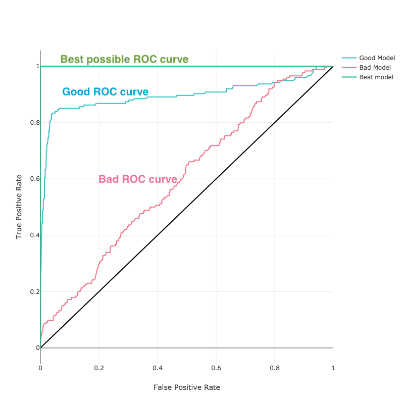
- AUC - for binary classification problems data science defines a Receiver Operator Characteristics (ROC) curve a comparison between True Positives and False Positives for both possible predictions (correct and incorrect). The Area Under Curve (AUC) is the total area under the ROC curve and its value is calculated with standard integral calculus method.
The closer the curve is to the upper left corner (the higher the AUC), the better the predictive model:
Accuracy vs Recall
In general, accuracy is the most common metric in data science, although it is not always the best metric to use.
Imagine, that you are exploring the factors that cause a rare disease. Let's assume only 1 patient out of 10,000 have got a disease, i.e. 0.01%. Now imagine that we have a very simple model to predict the disease: it always predicts "no disease”. This model would have an accuracy of 99.99%. However this is not helpful because the focus of the analysis is on predicting “disease”, rather than "no disease". So, as it is important for you to detect the disease, you should reject this model immediately despite its high accuracy.
In this case, we should check model performance using recall: the ratio of the number of patients where disease is correctly predicted to the total number of patients. For the very simple model that predicted no disease, the recall will be 0%.
Predictive metrics for Regression problem:
- Correlation - the coefficient, calculated on the predicted vs the actual value of the KPI. It shows the extent to which prediction and KPI values increase or decrease in parallel. Records with missing values in the drivers or KPI aren't taken into account. The best possible value is 1.
It's what we also call prediction accuracy, measured in percentages from 0% to 100% on Predictive Models slide.
- R-Squared - the proportion of the variance between the predicted and the actual values of the KPI, shown as the value between 0 and 1. Records with missing values in the drivers or KPI aren't taken into account. The higher the value, the better the predictive model.
- Root Mean-Squared Error (RMSE) - the average error of your predictions (difference between the predicted and actual values of the KPI). It shows how close model predictions are to actual values of the KPI. Records with missing values in the drivers or KPI aren't taken into account. The best possible value is 0.
- Mean-Squared Error (MSE) - it is a squared RMSE.
Confusion matrix
A confusion matrix is a chart used to check model performance for classification models in data science. It is extremely useful for measuring recall, precision, accuracy and AUC. By looking at the confusion matrix you can decide, how good your model classifies your data.
For binary classification, this chart will have two rows and two columns of predicted and actual values:
Note, that positive and negative do not mean emotional attitude. Data scientists call positive if the prediction tells what we are looking for ('true', disease found), and negative if the prediction tells what we are not looking for ('false', no disease found)
In this sense, we call:
- True Positive interpretation: the model predicted positive and it’s true.
- The model predicted that a patient has disease and he actually has.
- True Negative interpretation: the model predicted negative and it’s true.
- The model predicted that a patient does not have a disease and he actually does not.
- False Positive interpretation: the model predicted positive, but it’s false.
- The model predicted that a patient has disease but he actually does not.
- False Negative interpretation: the model predicted negative, but it’s false.
- The model predicted that a patient does not have a disease but he actually has.
Overfitting
Overfitting is a term, used in data science, when a model does not generalize well from the training data to unseen (validation) data. In data science it is known as a common problem.
Imagine, we want to predict if a student will land a job interview based on his resume. We built a model based on dataset of 10 000 observations and it predicts the target variable (yes or no) with 99% accuracy. But now comes the bad news.
When we test the model on a new unseen data (validation set), we only get 50% accuracy. That indicates, that the model has just learnt the training data "by heart" and won't deliver a prediction on new unseen data.
The best way to detect overfitting is to separate your data into training and test subsets. If our model does much better on the training set than on the test set, then we’re likely overfitting.
For example, it would be a big red flag if our model saw 99% accuracy on the training data but only 55% accuracy on the test data.
To prevent its model from overfitting, DataStories uses cross-validation method. That means, that our algorithm uses your initial training data to generate multiple mini train-test splits and further uses these splits to tune the model.
But sometimes using cross-validation is not enough and does not solve the problem.
Here are some recommendations if you see that the model performs bad on the validation data:
1. Train with more data:
Training with more data can help algorithms to learn better. Of course, that’s not always the case. If we just add more noisy data, this technique won’t help. That’s why you should always ensure your data is clean and relevant.
2. Remove irrelevant features:
DataStories algorithm has built-in feature selection. But still, observing the outcomes of the predictive analytics delivered by the model, you can manually improve the situation by removing irrelevant input features.
Regression
A type of problem where KPI has numerical values. Regression is a
process for predicting numerical results for your target variable.
Go to our case study to read House Price prediction story, which is regression problem.
Classification
A type of problem where KPI has certain limited number of values,
called classes or categories. Classification is a process of predicting
which class or category an observation belongs to, based on existing data
for which class or category is known.
Go to our case study to read Churn prediction story, which is binary classification.