Create your first story
Getting started with DataStories Platform is easy, first make sure you are logged in.
Data Set Requirements
File size: at most 40 MB File extensions: .xls, .xlsx, .csv, .txt
We impose the following requirements on the structure of the data:
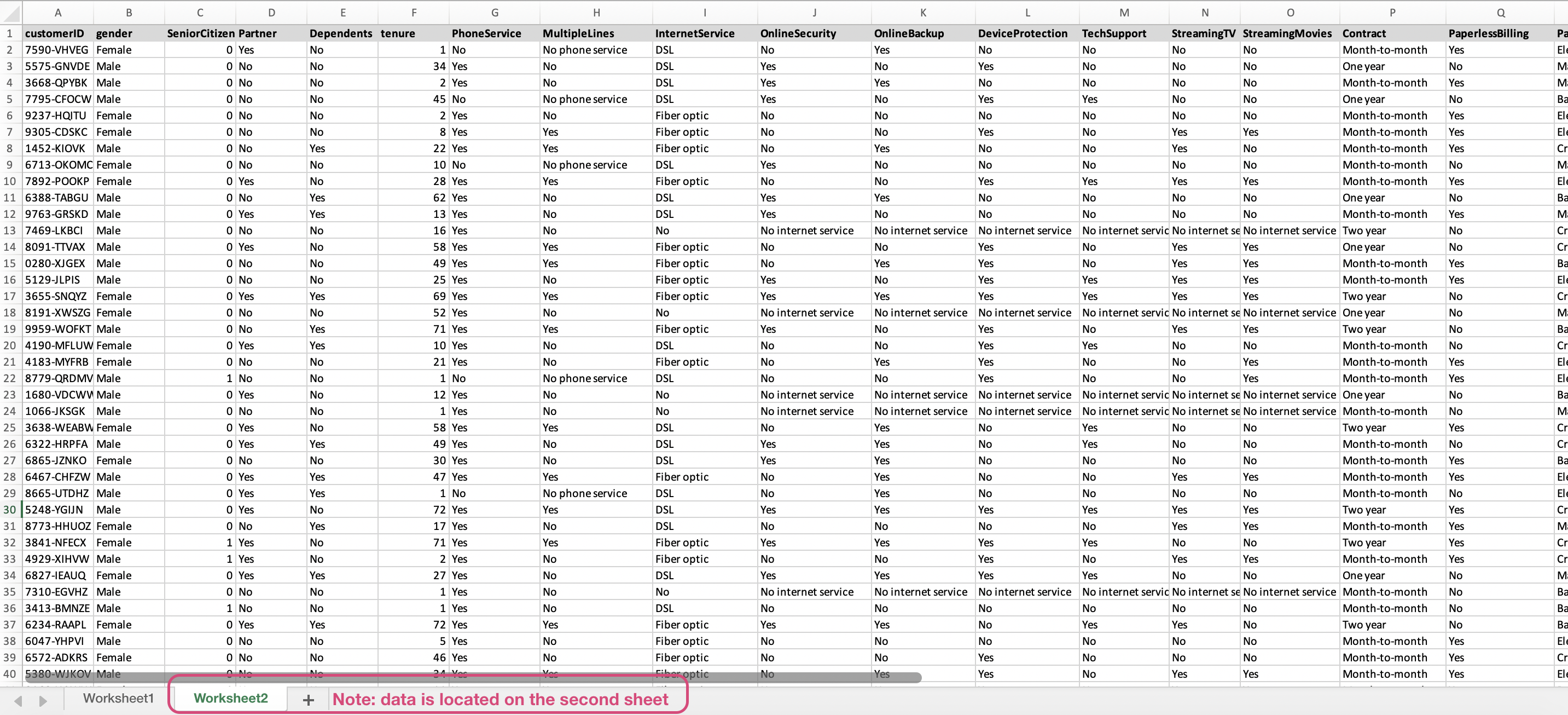
- The data is the first sheet of your file
- Each observation is a row
- Each measurement is a column
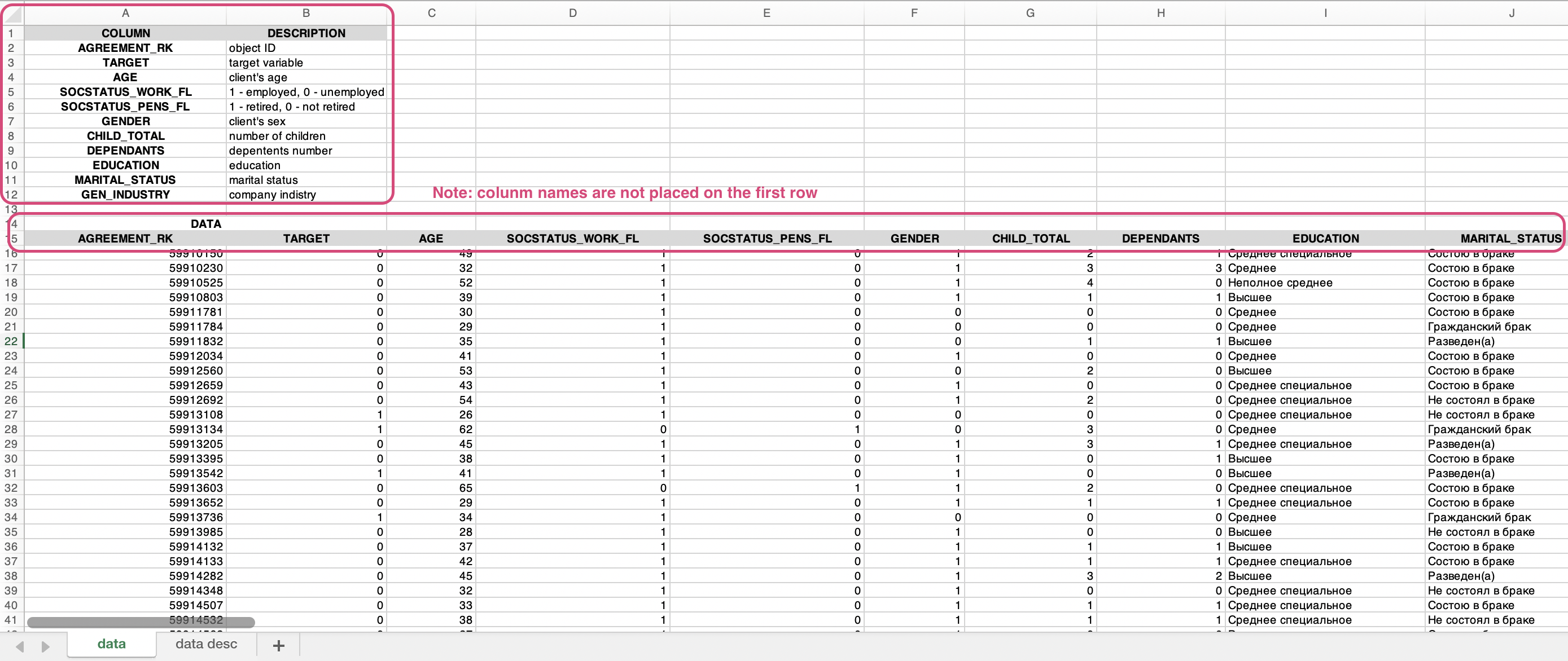
- Column names are placed in the first row of the table
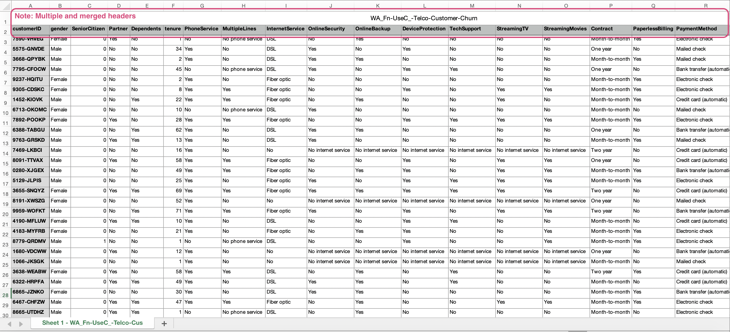
- Avoid multiple or merged headings (column names)
- Minimum 20 rows of data
- Delimiter for .csv: comma, semicolon, space or tab
A data set for uploading on DataStories platform should look something like this:
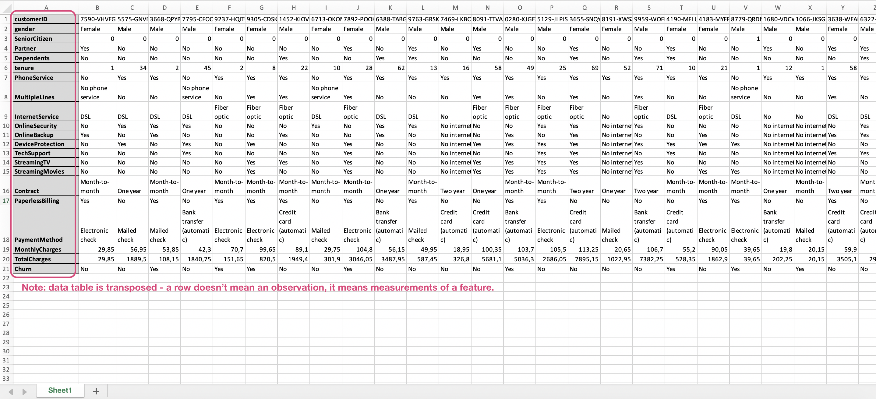
Here are examples of data files, that won't be parsed correctly by the platform:
Create a Story
With DataStories platform, you can solve both regression and binary classification problems.
.
To show how to create a story, we'll use a Churn data set.
This is a type of binary classification problem, where we try to predict the
Churn category (True or False):
whether a customer will leave the service in a certain period of time or not.
To start, go to Upload section of DataStories platform.
Step 1: Upload Data
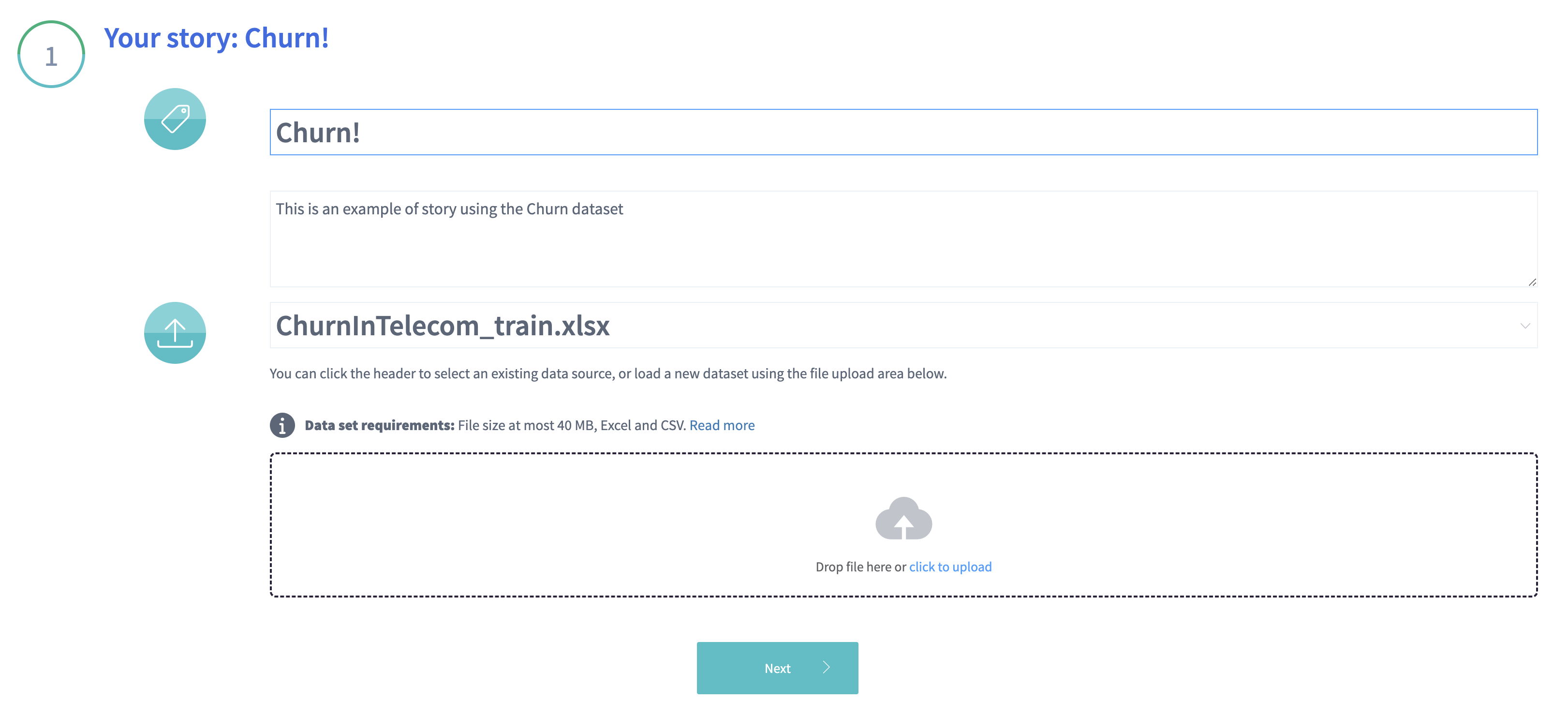
The first step is to select a data source, you want to analyse:
- if you have already uploaded data on the platform and want to use one of
those files, then click on
See all data sourcesor just start typing the name of the data source in the input fieldSelect the data source; - otherwise, you can select the training set on your PC and upload it onto the platform.
Click Next to overview the data and continue.
Step 2: Overview the data
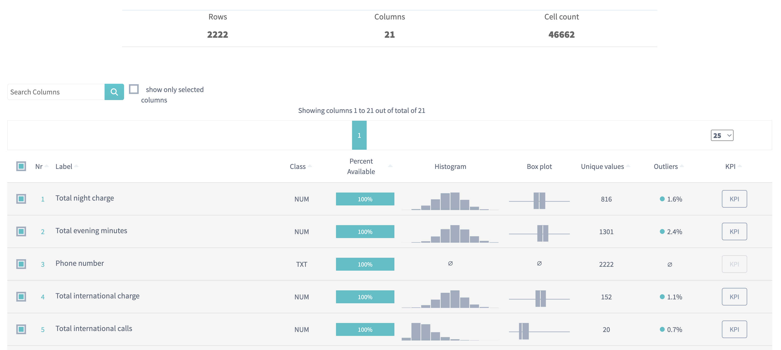
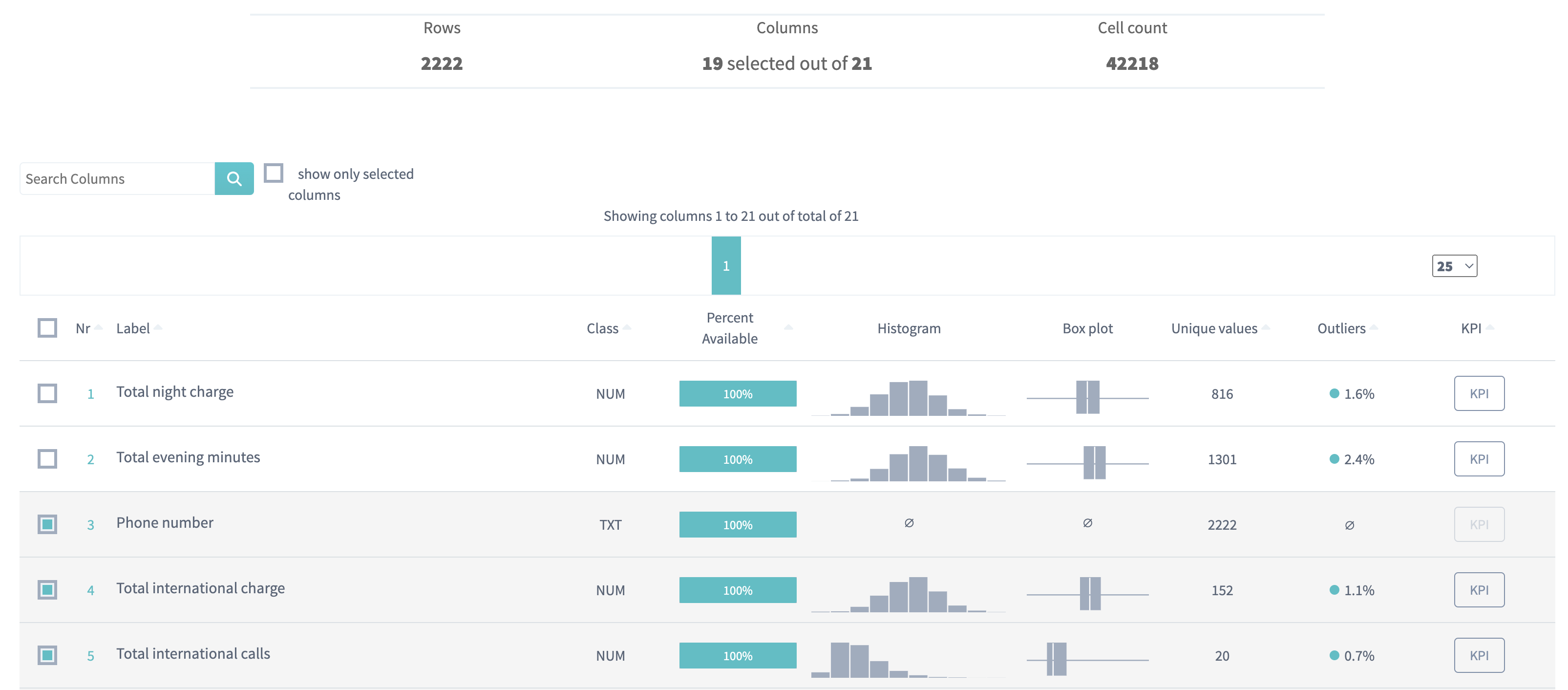
For the uploaded data source, DataStories platform will display the summary table to summarize the statistics of the data. Each row of the table represents one column of the original data. These rows are the variables (also called features) and KPIs that can be selected as the scenario for creating your story.
For each variable we automatically determine its class out of the following options:
- numeric (
NUM), which is a variable that was recognized to contain mostly numeric data and is represented internally as a floating-point number; - constant (
CONST), a variable containing only one unique value; - binary (
BIN), which is a variable with only 2 values; - categorical (
CAT), which is a variable containing less than 32 unique (mostly textual) values; - textual (
TXT), any remaining variables.
For each column, the data distribution is presented as a histogram and a box plot.
Unique values represent the number of distinct values for each variable.
Select your Key Performance Indicators (KPIs)
First, you need to choose the variables that you want to predict.
From now on we will call those your target variables,
the KPI,
the variables that will be predicted by using the other variables.
In our particular case, we're interested in churn prediction. That's why we choose 'Churn' as the KPI. Below in the table we can see that 'Churn' is a binary variable. Just click the KPI button on the row of your interest to select a variable as your target:
The DataStories platform requires the KPI columns:
- to be either binary (
BIN) or numeric (NUM) - you can observe the class of the column in the table. This decision will define the type of the problem that will be solved - for each KPI: either regression or binary classification. - to contain at least 20 values, otherwise statistical significance cannot be guaranteed.
The KPI columns will be automatically excluded from story inputs
to avoid trivial models, because predicting a column based on that same
column won't provide you any significant information.
- You can select multiple
KPIsat once: we will train a model that will predict all of them simultaneously. Important to note is that we will consider only rows that have all KPI values filled; - We don’t use one
KPIto predict anotherKPI. As mentioned above, theKPIscolumns will be excluded from story inputs. That means, that you won’t be able to select all the variables of your data set asKPIsand there should be at least 2 variables not selected asKPI.
Select Inputs
Second, you should decide which columns will be included into the analysis (be the inputs) and which won't. Not all of your data columns will help you to make a prediction. The success or failure of making a prediction model often depends on selecting the right (useful) columns from your data and deselecting the useless ones. How will you decide?
In general, there are some common recommendations for columns selection, but the DataStories platform itself detects some types of not useful columns and excludes them from the analysis after you create and submit a story.
We automatically exclude from the inputs:
- columns that have
TXTtype, - columns that have
CONSTtype (contain only one unique value), unless they contain one unique value and empty cells. Since in a Yes/No situation, people often leave the cell empty instead writing No.
We also recommend to deselect from inputs:
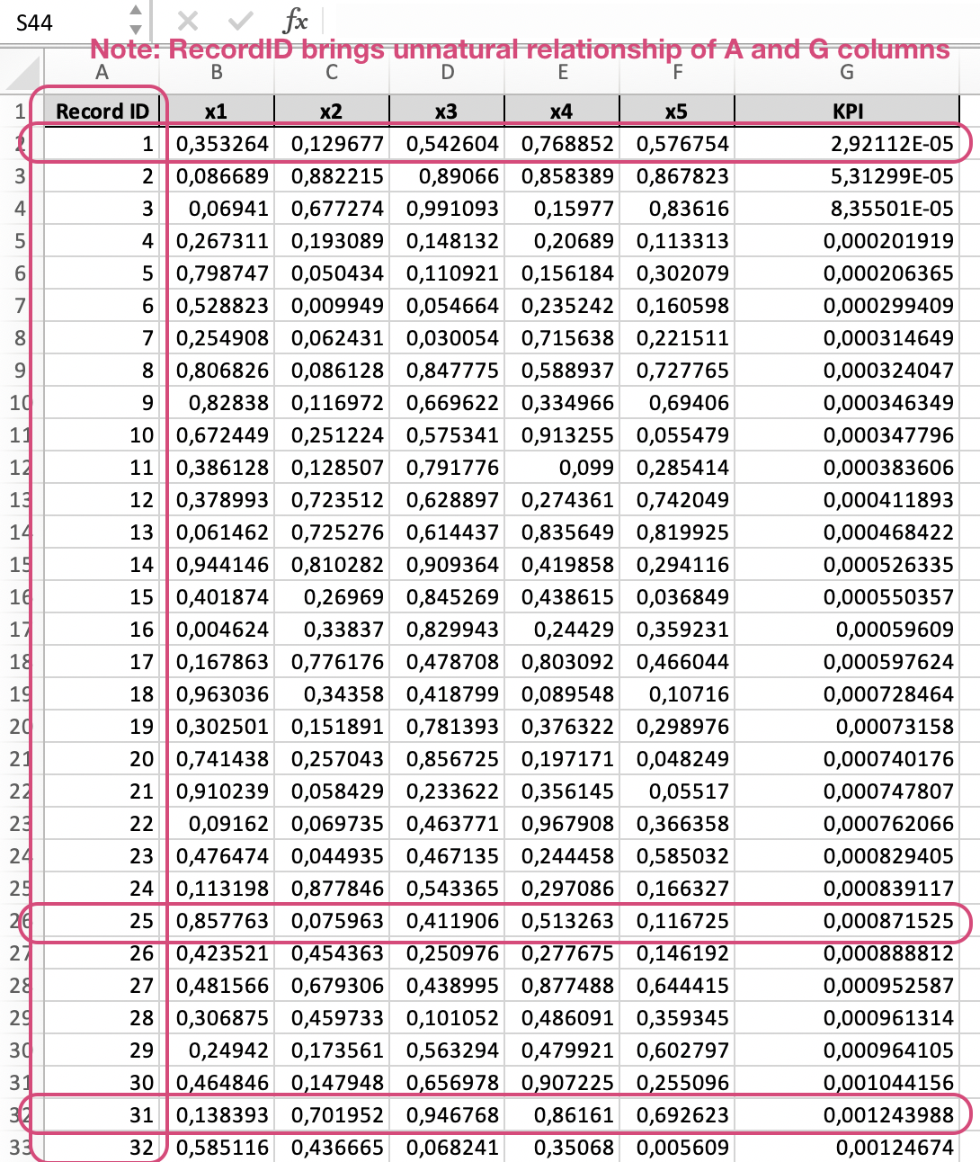
- Numeric columns that contain values identifying the row/record number, since this column can bring spurious correlations into your data.
In example below the presence of "Record ID" column adds some unnatural relationship of Record ID and KPI columns: the values in KPI column follow ascending as Record ID:
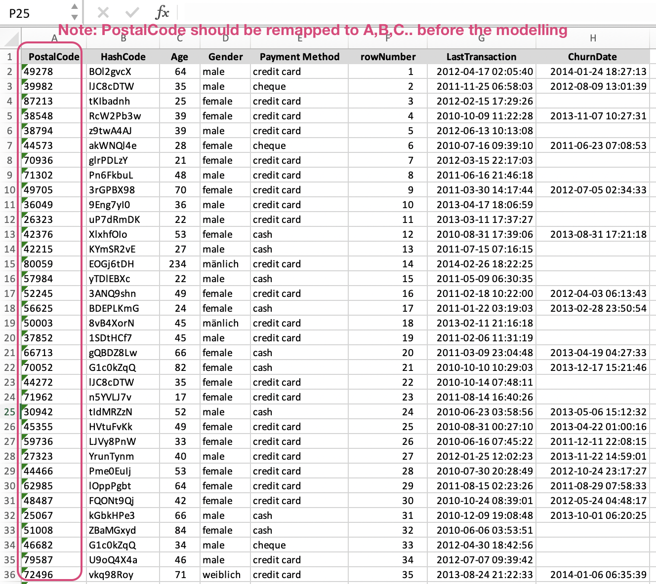
Postal code column also could be interpreted as ID while building the model, that's why it's better either to deselect it or to make this column textual by replacing numbers with letters.
With a numeric postal code column you can also bring some incorrect results to your modelling process. For example, the postal code can be picked by the model as a significant variable when predicting price, but the numerical value of a postal code is meaningless to do computations on. Therefore, you should change a postal code variable to string before modeling so it will be handled as a categorical variable or textual one.
- Numeric columns with less than 50% usable data (or more than 50% is missing), because they would make it difficult to ensure the results are statistically significant.
Only selected columns will be taken as inputs into the analysis.
Select / deselect the checkboxes on the left of each column name:
Tip: you can click on the headers of the table for sorting the values.
Adding filters for the data
Additionally, you might also want to add additional filters to your dataset. This can be done using the filter functionality below the data table. Filtering might be done on any input variables and on KPI variables. It is truly a filter on the dataset: the story will be created on a filtered dataset and rows that are filtered out are removed from all results. Your initial dataset is still available in your data sources.
When a filtering rule has been defined by not yet registered by our engine,
the Next button displays as a Filter button, to let you validate
your filtering.
The top of the summary table should then display a summary box with the filtering information:
When you're ready, press Next.
Step 3: Add extra preferences into your story
You're almost there! You can now set some additional parameters:
Adding story tags
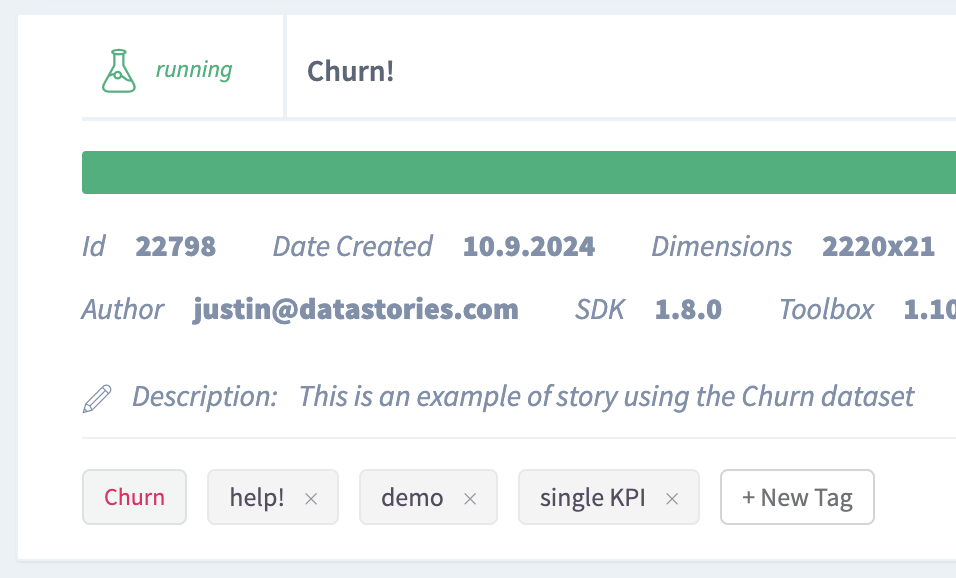
Unique tags for a story will help you to navigate easier between all your stories. Note, that the KPI name will be automatically picked up as a tag by the platform after you start the story.
Tag your story before submit. Just click 'New tag' and type a tag name.
The tags will appear in story description on your stories page:
Additional columns to track
We return the results of the analysis as a story, containing slides with plots and charts. If you want some columns (variables) to be added into the tooltips of these plots, you can select them in the dropdown. These selected columns won't effect your inputs - these variables won't be used as inputs of the analysis until they are selected in the table above.
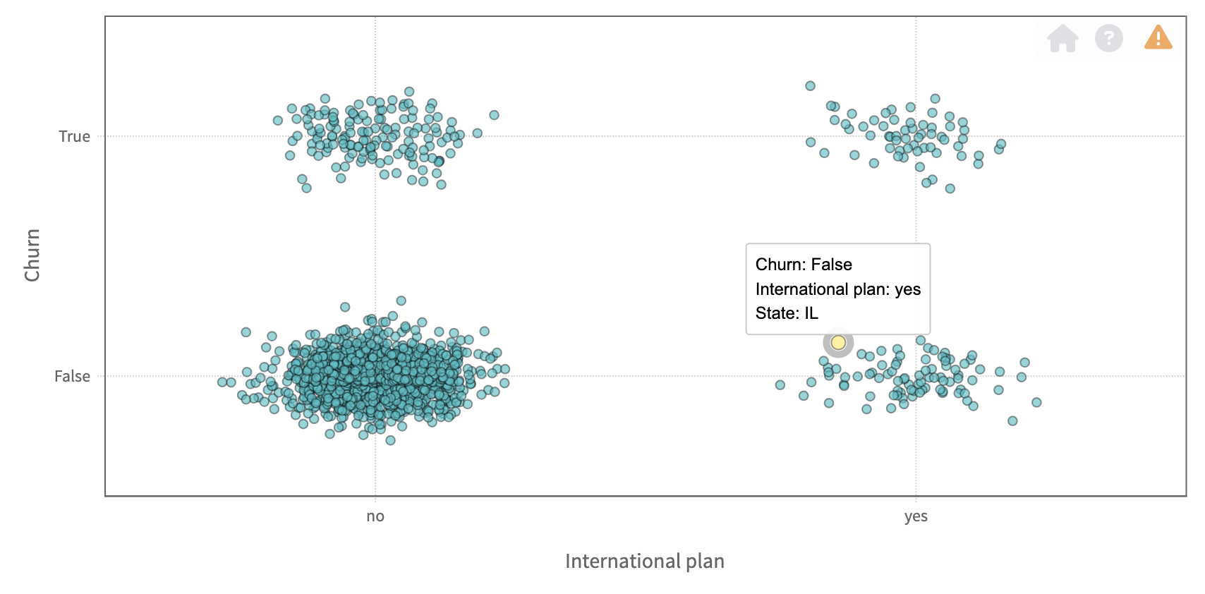
For example, if the variable gives some additional context to the individual records of your data like one individual record refers to a certain country or a state, you may want to follow this context through the story:
In many plots we display in our story results, you can see these tracked columns in the tooltips over the plots. For example, on scatter plot, you get the information about the X-axis, the Y-axis, and the extra tracked columns:
Algorithm settings
Number of independent modelling iterations - By changing this parameter you can choose how many independent runs of the DataStories algorithm will be applied to your data set. As we are using machine learning techiques, each time (iteration) it might give slightly different results (models). We will pick the models with the highest accuracy overall iterations for you. By increasing the independent runs, you can lower the influence of undesired stochastic effects.
Far outliers elimination - decide whether or not far outliers should be
removed from the data before the analysis or not.
When this option is ON, then we'll remove statistical outliers both
from the input columns and the KPI.
Read more in our glossary about statistical outliers.
Create PowerPoint slides
As an optional additional step, you can generate slides for your story. The slides will contain a PowerPoint version of the slides available on the platform.
Press Submit to start the analysis and generate the results.
Explore the results!
Once your story is ready, you'll see the notification - the counter of your
stories will be increased by one. The new story will be available and
marked as Ready.
You can navigate on the page and search for your story by using tags.
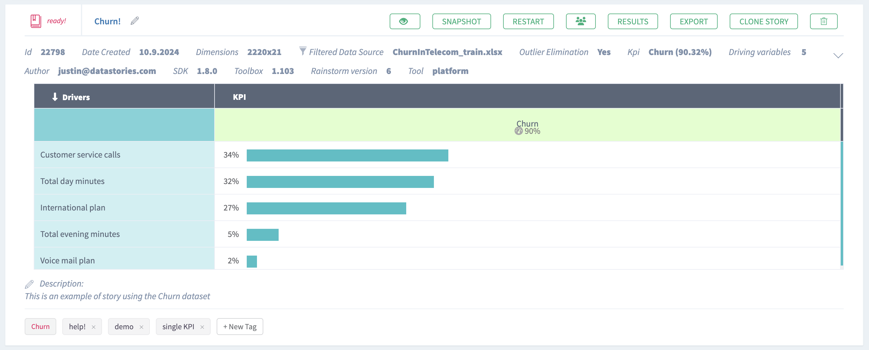
Click Results button to overview the story results.
Follow our case study
Case study about Churn prediction
for further reading about story results .
Try it yourself!
We've prepared the data sets for you.
Churn in telecom industry
Source: originally taken from Kaggle.
Data set description:
Churn, also called attrition, is a term used to indicate a customer leaving the service of a company in favor of another company. It is also referred as loss of clients or customers. One industry in which churn rates are particularly useful is the telecommunications industry, because nowadays most customers have multiple options to choose a telecom operator.
The data has been split into two groups:
-
Training set: number of columns 21, number of records 2222. Download Churn_train.xlsx
-
Validation set: number of columns 21, number of records 1111. Download Churn_test.xlsx
Read more in Glossary about the training and validation data.
Data set attribute information: Name | Type | Description | --- | --- | --- | ---
Churn| binary | Target. Indicator of whether the customer has left the company (true or false) Customer service calls | numeric | Number of calls to customer service Total international charge | numeric | Total international charge in USD Total international calls | numeric | Total number of international calls Total international minutes | numeric | Minutes customer used service to make international calls Total night charge | numeric | Total night charge in USD Total night calls | numeric | Total number of night calls Total night minutes | numeric | Minutes customer used service during the night Total evening charge | numeric | Total evening charge in USD Total evening calls | numeric | Total number of evening calls Total evening minutes | numeric | Minutes customer used service during the evening Total day charge | numeric | Total day charge in USD
Total day calls | numeric | Total number of day calls
Total day minutes | numeric | Minutes customer used service during the day Number of voice mail messages | numeric | Total number of voice mail messages Voice mail plan | binary | Whether customer has the voice mail plan (yes or no) International plan | binary | Whether customer has the international plan (yes or no) Phone number | numeric | Customer's number. Essentially a surrogate for customer ID Area code | categorical | Customer's area code Account length | numeric | How long customer's account has been active State | textual | 50 states and the District of Columbia
Follow our case study
Case study about Churn prediction
to discover how to interpret a typical
binary classification problem using this data set.
Prices on houses
Source: originally taken from Kaggle.
Data set description:
The data set compiled by Dean De Cock contains observations on houses prices. Each observation is characterised by many features describing the residential homes in Ames area, Iowa.
The data has been split into two groups:
-
Training set: number of columns 79, number of records 1168. Download Housedata_train.xlsx
-
Validation set: number of columns 79, number of records 292. Download Housedata_test.xlsx
Data set attribute information: you can find it here.
Follow our case study
Case study about House Price prediction
to discover how to interpret a typical
regression problem using this data set.
Baking process
Data set description:
The data set provided by AS4 Point, a software for digital quality management systems for the food industry.
The data is only available as a training set, and we won't use validation on it, as it is too small.
- Training set: number of columns 21, number of records 50. Download Baking_train.xlsx
Follow our case study
Case study about Baking Process
to discover how to interpret a typical
multi-KPI problem using this data set.
